

Well things were up last week but without actually tracing back to the date the test was taken and not the date the result was reported, it is hard to separate how much of this is clearing the backlog from the holiday weekend and how much of it is new. This week is going to be more informative. It does look like a lot of the previous hot spots have cooled off but some new ones have flared which probably extends this wave a little longer.
A little personal note first. A couple of weeks ago, our local newspaper had a front page article on how hospitals were being overwhelmed. Since then, hospital census has declined. More so in the north than the south but overall the numbers are down. Waiting to see if the newspaper decides to report this.
The overview for the week ending on 12/5 is that we again set an all time records for tests (12.5 million), positive results (1.3 million) and negative results (9.1 million). The numbers don’t add up for reasons – states report things inconsistently and some don’t report negative results. The percentage of positive results was 10.4% which is a new local high. So we wait and see what this week holds.
With hospitalizations, we got another one day drop but then things went back up but the last four days the increase has been less than 1%. We did see a surge in cases early last week which has not yet translated to hospitalizations. But we do have a couple of large states potentially surging so it would not be a shock if we see another leg up. Right now, it looks like a top is trying to form but it can’t be called yet.

With ICU population, we also still continue to see increases every day. But, like hospitalizations, the rate of increase has been less than 1% for the last four days. Again, it looks like a top is trying to form but we have to see how things are going to play out in the newer hot spots.

One of the things I’ve done is to focus on percentage of positive results rather than just counting positives. The logic for that is that presenting the numerator without the denominator is partial information and can be truly misleading if the number of tests takes a huge jump. But it does mean I’ve neglected the visual impact of that jump. And if that is all you are looking at, it is no wonder the fear and panic are up in places because the increase looks scary.
To illustrate, I have graphed 10 day moving averages of new cases and new deaths. A couple of caveats. First, this comes from a different source (Worldometer). I used them because the data on totals for the US were just easier to get and track. Secondly, the death numbers are date they were reported and not day of death. I think most of the increase we see is real but some of it is still clearing old cases. The death numbers look like saw teeth because we get a lot of bulk reporting from states – drops of large numbers on certain days.
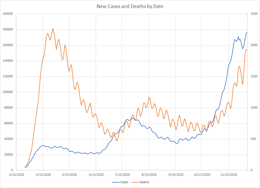
The scales are different – cases on the left and deaths on the right – I should have labelled that to avoid confusion. I’ve said deaths tend to lag cases and that was maybe more true in the first two waves. You do see that deaths in the summer peaked in August while cases were on the decline. Deaths in this third wave did start increasing after cases so maybe there is still some truth. The waggle at the end for cases is the dip due to lack of reporting for Thanksgiving followed by the clearing of those unreported records (with maybe some new cases tossed in).
You do have to remember that we didn’t have the testing capacity back in April or July. If we were testing at the same rate, I’d expect those curves to be much higher. Still, it is accurate to say that the number of cases really took off from mid October until now. Unfortunately, by the time we start to get some clarity about what really happened over Thanksgiving, we are going to be into Christmas which is likely to be a much greater disruption in the data.
I’m going to skip the graphs for now. A couple of states (Washington, Oregon and Wyoming) seem to be having trouble getting updated numbers so it makes the graphs look a little odd.
What I can do is these tables. This is only looking at last week vs the week of Thanksgiving. My graphs compile data over multiple weeks to smooth out some of the noise. This potentially identifies places to watch. And it gives you an idea of the relative size difference between the states.
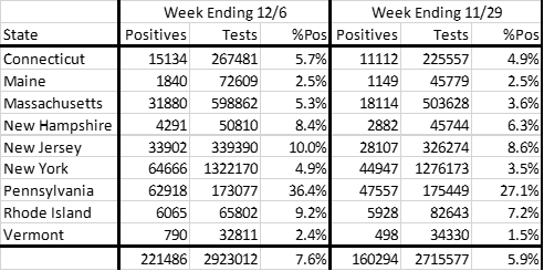
Start in the Northeast where everything went up last week. While the percentage of positive results remains low, we see several places approaching 10%. This area has been on the rise for several weeks although we have yet to see any state but Pennsylvania break out into real exponential growth. The increase in New York puts them on the places to watch just due to the sheer number of cases.
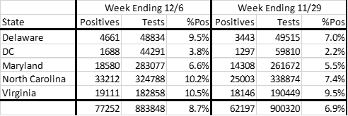
Move down the coast a bit and you get this group where again we saw an increase in cases and percentage of positive results. In this case, the number of tests actually went down slightly so this is a real rise and not a function of increased testing. Every place was up but the largest increase looks to be North Carolina. A reminder that we don’t yet know how much of this is new results but the increase in percentage of positive results could be the start of an upward movement. Yes, I’m intentionally being non committal but if this is going to become a problematic area, we should know soon.
Coming back to the big Midwestern states, the overall numbers reflect stabilization. Yes, we saw an increase but it is much smaller than the other regions. Among the states, Indiana is the only one that saw an increase. As a whole, the number of positives increased by 10062. In Indiana, the increase was 10350 so that state is responsible for the small increase we see.

In this next small group, we again see cases and positives go up. In Kentucky, we saw more positives but also more tests so the percentage of positives went down. The other two showed clear increases. Tennessee is similar to North Carolina in terms of the actual numbers and, like North Carolina, things had been mostly flat there so the concern for both places is that this would be the start of the rapid acceleration that most states have had at one time. Again, we’ll know more after this week.

In the South, we also had a region that had been relatively flat except for Alabama and Mississippi which just had a lot of variability. Same story here in that we see a big increase in cases and percentage of positives even with about the same number of tests. Broken record but we need more data to really know if this is the start of a real trend.

Next we come to what was a hot spot. Cases and tests were down while percentage of positive results was up. North Dakota showed the biggest drop. Reporting is a little inconsistent in Iowa, Nebraska and South Dakota. But this region is in much better shape than it was a month or so ago.

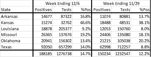
Another collection of states where we see an increase from last week but it is dominated by Texas but Arkansas also would be of concern. Kansas only reports on certain days and I don’t know how much trust to place in their data. If Texas again becomes a hot spot, then that would certainly keep the numbers high.
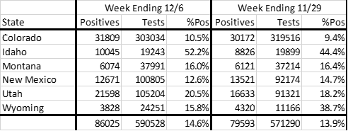
Moving into the Rockies, we see smaller increase in cases and percentage of positive results with similar testing numbers. New Mexico is the most interesting as they saw drops in both. They looked to be a real hot spot a couple of weeks ago but maybe things have cooled off there. Colorado and Montana were flat while we saw increase in Utah and Idaho. As previously mentioned, Wyoming sometimes updates things weeks after so I can’t put much faith in their data.
In the last group, feel free to ignore some of the data from Oregon and Washington. There is some kind of mistake in the Oregon data and Washington basically stopped reporting negative results until a few days ago. Washington was down in terms of number of cases and Oregon was up. We had increases in all other states although Nevada and Hawaii were small. Most concern would be for Arizona and California. California had more cases and a higher percentage of positive results with fewer tests.

Now I realize that I wrote something before Thanksgiving expecting to see the numbers increase. That’s true but what I would have expected is a bump in testing without an increase in the percentage of results that were positive. But I would not overreact to a single week over week change. It is an area of concern that we saw increases in a lot of big states. And it could be that this wave is moving out of the upper Midwest and Rockies and back into the rest of the country. At this point, I’m not going to predict one way or the other – we need to see if this trend continues this week.
