


We’ve never really done the extended family thing for Thanksgiving so this was going to be a quiet day even before covid. We do have a sibling group call later this afternoon so we’ll touch base that way. Just got back from a nice walk in the cold and damp. Lots of people out and about – guess it is a way to kill time before the big feast. And maybe then you feel better about the second slice of pumpkin pie if you took a walk earlier in the day.
But since we don’t need a lot of prep for what we are making, I had time on my hands and decided to make some different graphs. When I get caught up in data, I often think of multiple ways to present things so this is nothing new for me. Plus, it seems likely that the holiday is going to distort the numbers due to reporting gaps so this is the last chance to get a good read on where things stand.
What I’ve done is just a rolling two week summary of the total percentage of test results that were positive. Unlike my other graphs, I’ve set the dates up differently so each point is a summary of the previous two weeks. Sorry for the confusion but I can never do things the same way twice. The data is current to yesterday. I’ve got the spreadsheet set up in a way that it may be easier to update but we’ll have to see about that.
The two week window is more sensitive to changes. I like the other approach because my windows are fixed blocks – each one is a week and so probably less sensitive to the day to day fluctuations in reporting. So each method has pros and cons. I guess it is like the stock market where they use different moving averages. This one likely gives an earlier indicator of a change and then we wait for confirmation from the other method.
Graphs are works in progress. I suspect if I keep up with this, I’ll chop off more of the beginning when the numbers kind of bounce around. Oh and I used lines rather than lines with symbols because now that I’ve got a point for every day, it made the lines too messy to use symbols.
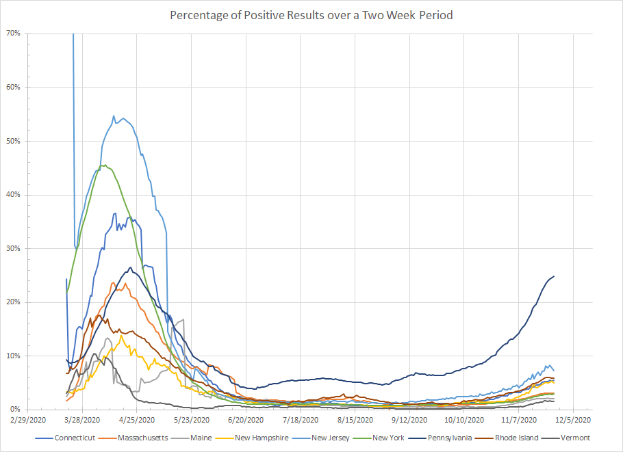
Anyway, let’s just get to the graphs. Here is the Northeast. The two week window doesn’t smooth as much as my other graphs so these lines are choppier but they aren’t going to be that much different than the other ones. In this one, Pennsylvania is starting to flatten while New Jersey may have already peaked. Same might be true for New Hampshire, Vermont and Rhode Island although it gets harder to see the various lines.
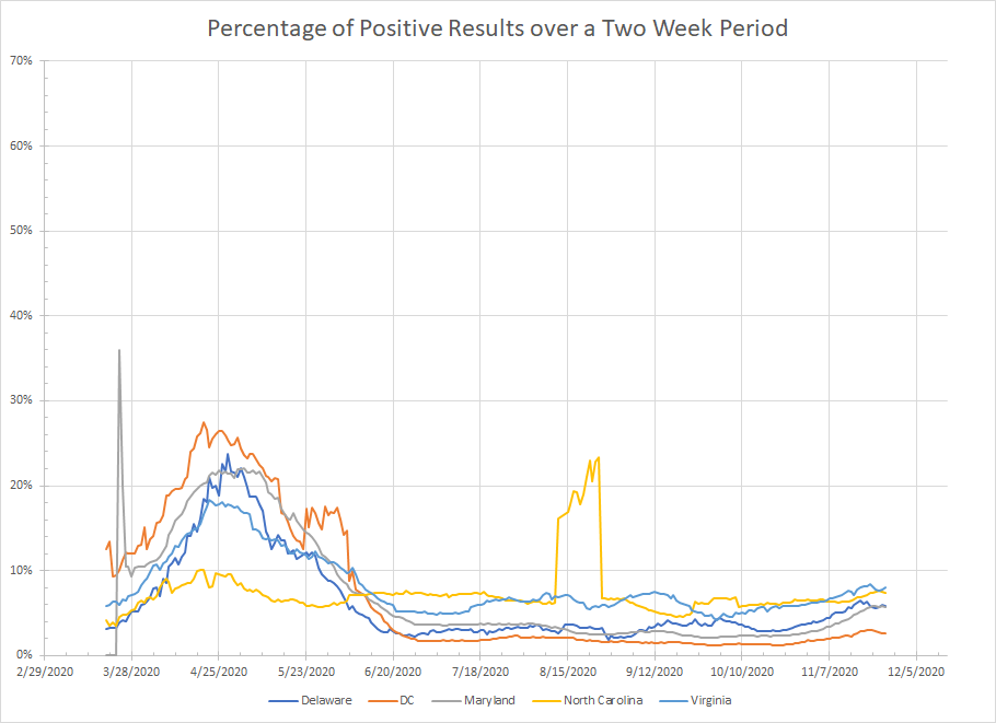
Here is the next one. I can’t explain what happened in North Carolina in August other than testing was down for some reason so there might have been a glitch in the data. None of these states really look to be seeing a major surge so there isn’t much to say about the graph.
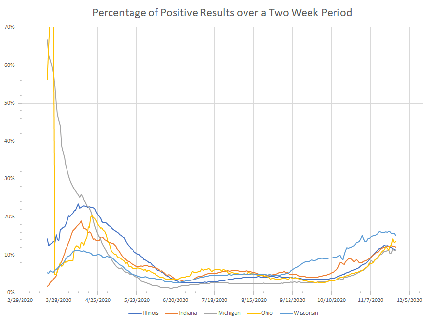
Now to the Midwest. The smaller window makes the Wisconsin peak a little more obvious and it does seem things are tending down there. We actually get similar stores for both Illinois and Indiana. With the possible exception of Ohio, it looks like everything has peaked here.
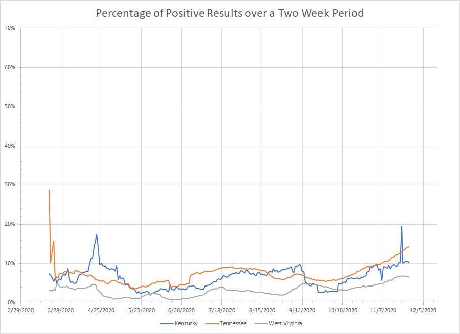
Now this one is a bit more interesting. We get some unexplained spikes in Kentucky but it looks to be flat along with West Virginia. Tennessee seems to be the exception with positive cases on the rise although it does not look like a typical exponential increase.
To the deep South we go. Lots of spikiness in Mississippi. In places where you get gaps or inconsistencies in reporting, two weeks isn’t enough to smooth everything out. Still the general trend there is flat as it is for the rest of the bunch. Florida did start to curve upwards but the most recent data is flat. But none of these places seem to be in any kind of real surge.

Back to the upper Midwest we go. Now my other chart stopped with Sunday’s data while this one includes data through Wednesday. But every state here appears to have peaked. The down turns are more obvious in Iowa, South Dakota and North Dakota but there are no lines trending upward.

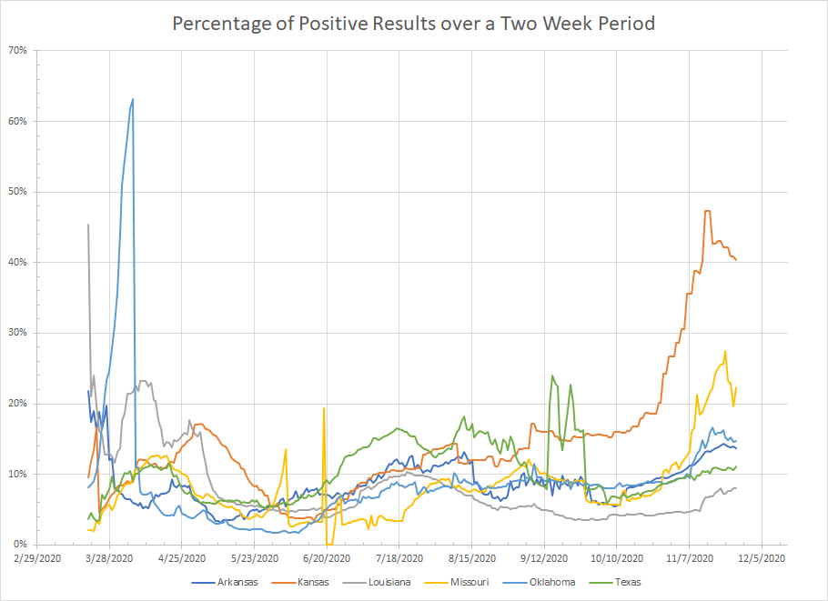
We get a similar story with this next group. The rapid climb in Kansas and Missouri had potentially started to reverse. Oklahoma and Arkansas are also trending down. Texas and Louisiana are trending up but the rate of increase is still small.
Our next stop is the Rockies. The curves for Idaho, Montana, Utah and Colorado are flat. We still see a rapid increase in Wyoming and New Mexico. In this region, the difference between the two week and four week smoothing is maybe most obvious. We are potentially getting early signals of a top in most places. The clear exceptions are Wyoming and New Mexico.

Now we get to the West Coast. Washington is a little misleading because they’ve only reported positive results for the last couple of days which is why the percentage of positive results is going almost vertical. I read that they are going to shut down reporting until December 1 so who know what their graph will look like. The glitch with Alaska in my other post was fixed but their data still jumps around a lot. Hawaii is clearly flat to down but the other states are trending up. Oregon and Arizona look to be the worst in terms of the growth rate. But we know that sometimes things start slow and then ramp up so we have to watch California.

Anyway, that’s just a different cut of the same data (well mostly the same). I have no idea how much of a mess we are going to get over this holiday weekend so it might make this format unusable. But this level of smoothing suggests that the biggest part of the surge is over in most places. We still have concerns about New Mexico, Wyoming, Arizona, Oregon and maybe Tennessee.
To be fair, I should point out that even if cases aren’t rapidly increasing, a long peak at a high number is still going to add a lot of stress to the system. And the way down usually takes as long as the way up so we are a long way from getting those places back to a low baseline level of cases.
And, I would prefer to see confirmation in my other graph before truly concluding that the rapid rise is over. It looks that way but I’m still not familiar enough with the two week smoothing to know how good it is at identifying peaks.
Now I’ll stop tossing numbers and graphs at you.
