

Omicron is a much milder version of COVID. More like a cold than anything else. Or is it? One thing that has sadly been true about this whole pandemic is that the “official” information lags far behind what comes from other sources. The early information out of South Africa has been positive and it is starting to be confirmed in other places. Is it true? Maybe but I think it is still too early to say with complete certainty.
One thing is very true and that is cases have exploded and, as of right now, deaths have not yet followed. The most widely available figure is the case fatality rate (cfr) which is just the total number of deaths divided by the total number of cases. It isn’t the actual fatality rate because a significant number of cases don’t get reported but since most sources show cases and deaths, it is the easiest to look at.
All data in this post come from the WHO. Again, I’m using their regions which don’t correspond to actual continents. At the end of 2020, the cfr for the world was 2.2%. On April 16th, it dropped to 2.1% but increased back to 2.2% on June 3rd because one country revisited their data and added a significant number of deaths. It dropped back to 2.1% on July 24th and then to 2.0% on September 25th. On December 22nd, it dropped to 1.9% and then on January 6th, it dropped again to 1.8%.
The reason for going through all that was to show that this number is relatively stable and, under normal circumstances, it doesn’t move quickly. It was taking about 3 months to drop 0.1% but, once Omicron started to take off, it only took two weeks to see the cfr drop by 0.1%.
But it is better to show this graphically. Here you have cases and deaths plotted on different scales so you can see the patterns. I’ve used seven day totals just to smooth out some of the reporting glitches that come up.
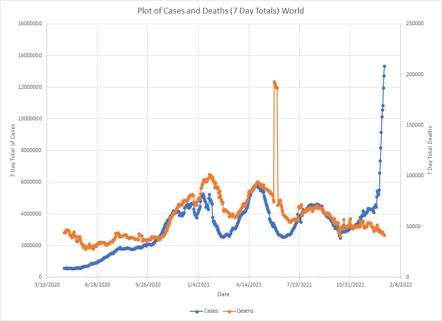
In general, the line for deaths follows the same trend as the line for cases with a bit of a lag. When we see cases go into a wave, we get a wave in deaths soon after. A new wave started in October and then took off when Omicron became the dominant variant. The lines is almost vertical and more than double any previous peak in cases. But we aren’t seeing anything close to the same pattern in deaths. In fact, they’ve been declining even as cases are skyrocketing.
But I want to go region by region. There is some potential bad news that I’ll get to at the end. First, there are two WHO regions where Omicron is still in the beginning stages. The first is the Eastern Mediterranean which is the Middle East and some of North Africa.
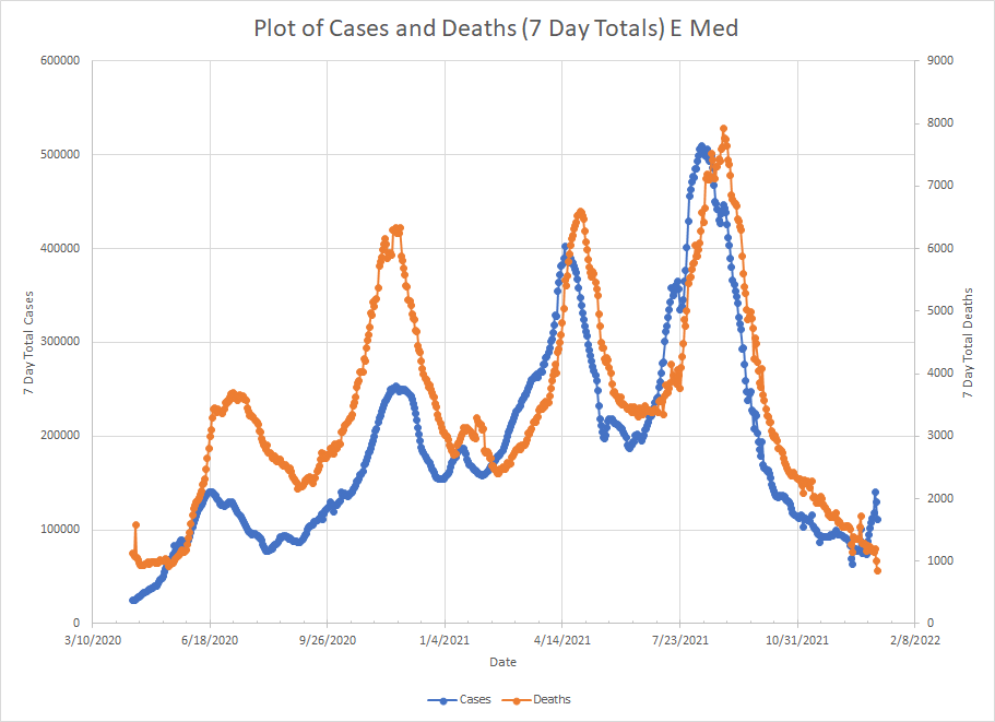
You get the same pattern of peaks in the death curve shortly after peaks in the case curve. Cases have just started to turn up so not much to say about that.
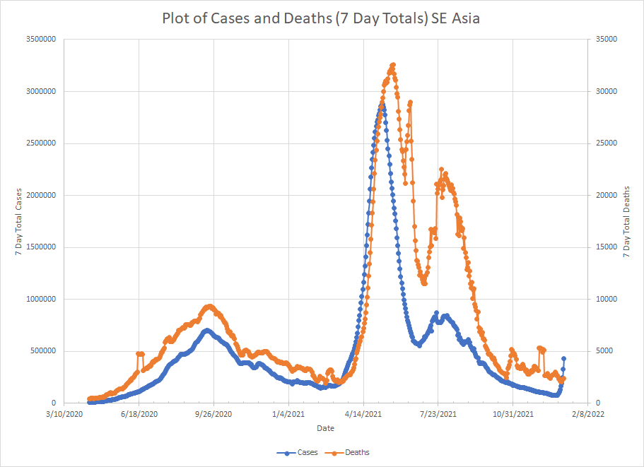
The second region where things are just getting started is SE Asia. The biggest country here is India.
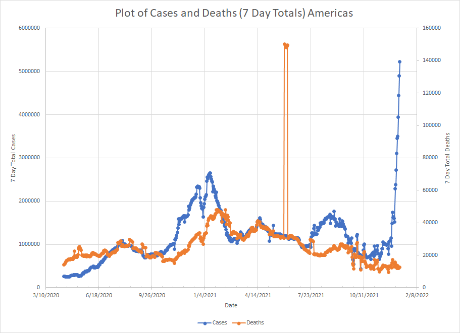
The next region is the Americas which is North and South America. The US dominates this region but cases have started picking up in other places as well. Cases started going up in mid December but deaths have basically been flat.
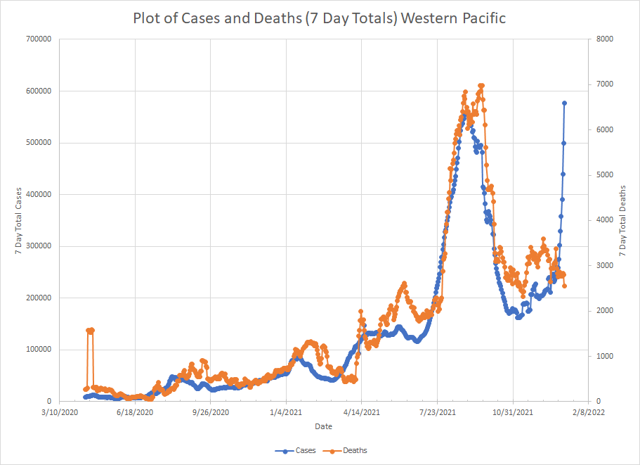
Then we have the Western Pacific region which includes China, Japan and down to Australia and New Zealand. Right now, Australia is one of the bigger drivers in cases. The wave started in early November but really didn’t start going vertical until late December. We did see an initial rise in deaths but they have actually started to fall lately.
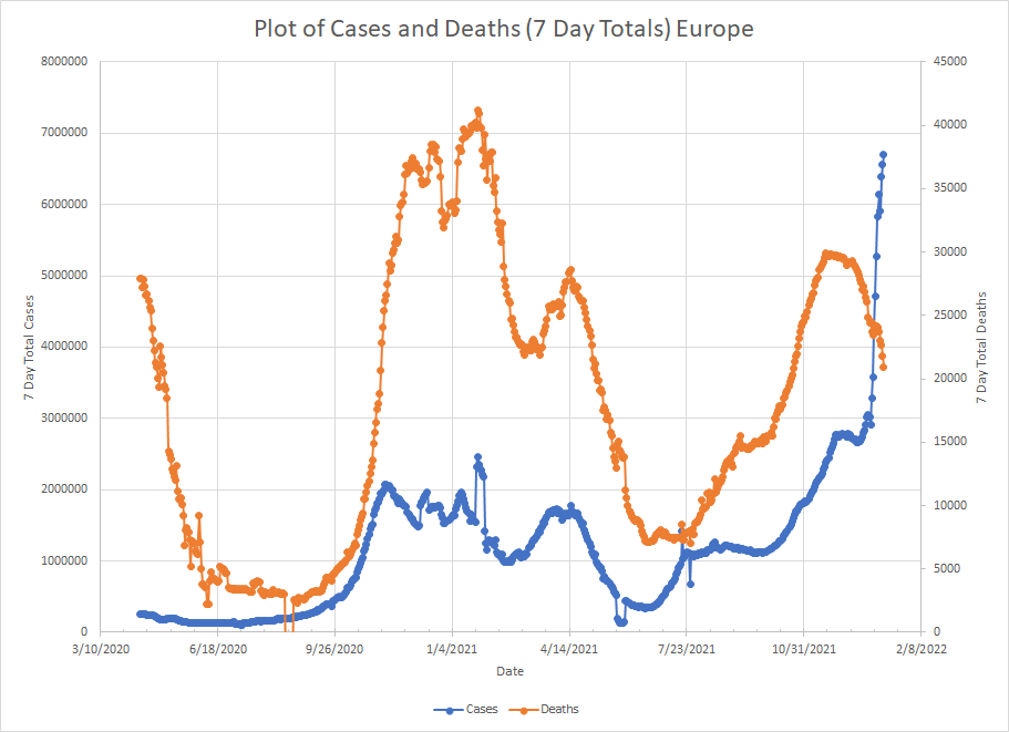
Then we have Europe. They started to see a wave in late September which looked like it was peaking in late November. Then, things really started taking off in late December. They saw a steady increase in deaths actually starting in late July and it reached a peak in late November about when cases started to flatten. But, since then, as cases have gone way up, deaths have actually been dropping.
Now we get to the one that seem to be the exception and that is Africa which has been dominated by South Africa although we have seen cases go up in other places as well. The actual numbers are just much higher in South Africa so it dominates the graphs.
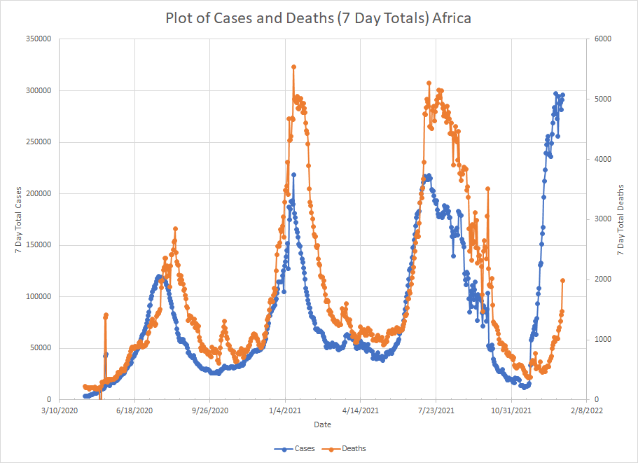
Reporting in some countries in Africa is spotty so we only get updates once a week or less and that creates some choppiness in the graphs. Still, you see peaks in cases in January and July of this year followed by peaks in deaths. It looks like the Omicron wave started in late November and may have hit some kind of peak as we aren’t seeing cases increasing.
The death curve didn’t start going up until late December but since then, it has roughly tracked the case curve although certainly at much lower levels. The current 7 day total is less than half of the earlier peaks. I can’t speak to the reasons behind this pattern. Why does there seem to be a longer lag between cases and deaths? Are these more deaths “with” as opposed to deaths “from”?
Given that the current peak in cases in Africa is substantially higher than any previous peak and that deaths are less than half of previous peaks, it does look like Omicron is milder than previous variants. But until we know where the death line is going to go, we can’t say that with real certainty.
The rest of January is going to tell the story.
