
And I’ve got a new graph to show you!
I decided not to wait until the weekend because there are some very hopeful trends in the data right now. Of course the next two days could come in and dash that hope on the rocks but I tend to think that won’t happen. Once a trend is established, it tends to run for a bit.
Some quick background first. I’m focusing on cases and all data comes from the WorldoMeter site. It is not as good as the Covid Tracker but they stopped compiling so you take what you can get. Case counts can be misleading because there is a lag between when a test was done and when it gets reported. We see patterns where case counts are lower on Sunday and early in the week before rising through the week. Now some of the states that don’t report on weekends (Connecticut) see spikes on Monday but the general pattern is the numbers are always higher later in the week.
What I noticed is that comparing this week to last week, the case counts have been down every single day. And the drop offs in the last two days have been large. So I went back six weeks and graphed cases by day and the result is:
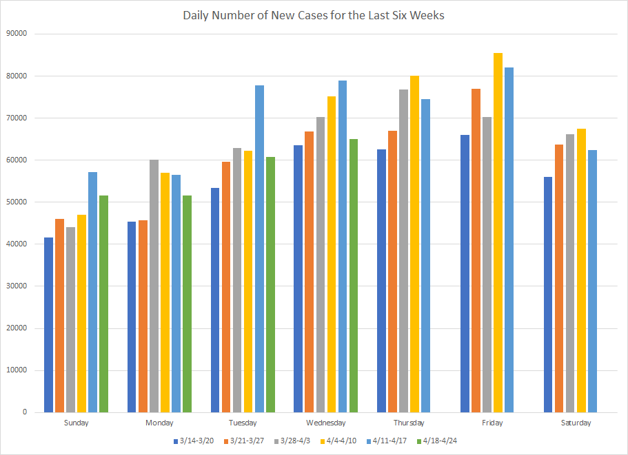
The dark blue bars are the week of March 14th and you see that they are lower than the rest of the bars on each day. The orange bars are the week of March 21st and you can see that the gap between the orange and blue starts to widen by the end of the week. The grey bars tend to be higher than the orange bars but we only see big gaps on a couple of days but things are still going up. The yellow bars are the first full week in April and they are higher than the grey bars on five of the seven days as cases continued to climb. Note that the highest bar is on Friday of that week which now looks like when things peaked.
The light blue bars start out the week higher than the yellow bars and set new highes for Sunday, Tuesday and Wednesday. But, by the end of the week, the totals were below the yellow bars. In total, the week still showed an increase but the last three days may have been the first sign that things were starting to fall.
The green bars are this week which isn’t finished yet. As I mentioned in the beginning, every day this week has been below the total from last week. But what has happened as the week has progressed is that the green bars are also coming in lower than yellow and grey bars. The last two days have been more like the end of March. Unless we’ve got a bunch of states with severe delays in reporting, the totals for this week could be the lowest in several weeks. It certainly looks like we are going to see our first drop in cases in many weeks.
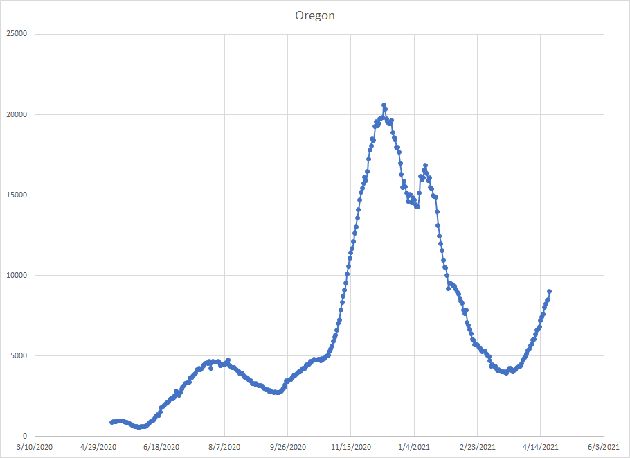
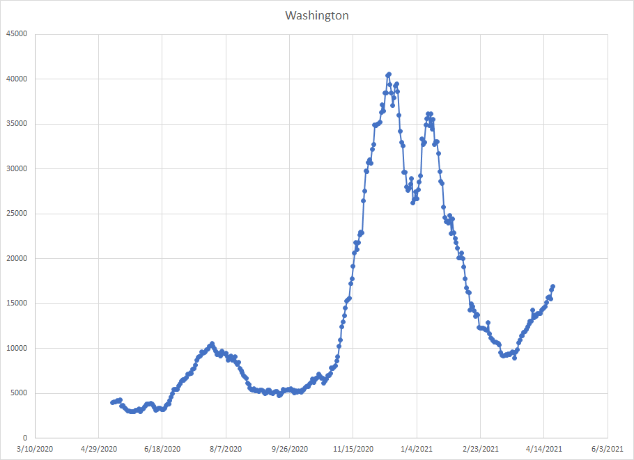
Currently, the states showing the largest weekly increase in cases are Maine, Michigan, Vermont, Oregon, Pennsylvania, New Hampshire, Delaware, New Jersey, Washington, Minnesota, Colorado, New York, Florida and Maryland. It is also fair to point out that these increases are nothing like we’d see in a true wave but it gives us a group to look at. And this is the list of usual suspects I’ve been talking about for the last couple of weeks.
One of things I do is try to predict cases a week out. All I do is look at the current average number of cases (using my 10 day moving average) and then multiply by seven assuming that the state will continue at this average for the next week. There are certainly more sophisticated models but I use this just as a way of trying to spot early trends.
To illustrate, on April 14th, this method predicted Utah would have 393862 cases on April 21. They actually had 393862. No it doesn’t work perfectly all the time. It works best when a state is in a plateau where the number of cases is relatively consistent from day to day. But that’s why it is useful for spotting trends. If cases start rising, the prediction will come in low. If cases start falling the prediction will come in high. So you can track where the states are and it helps identify hot spots.
The table below shows those 14 states and the number of actual and projected cases for yesterday. The last column is the error and I’ve sorted by that so you can see where the problems are.
| State | Projected | Actual | Error |
| Maine | 57902 | 58465 | -1.0 |
| Oregon | 175933 | 177134 | -0.7 |
| Delaware | 101712 | 101993 | -0.3 |
| Washington | 391573 | 392385 | -0.2 |
| Florida | 2183588 | 2184354 | 0.0 |
| Colorado | 494806 | 494521 | 0.1 |
| Maryland | 439466 | 438789 | 0.2 |
| New Jersey | 988886 | 987350 | 0.2 |
| Pennsylvania | 1126236 | 1124073 | 0.2 |
| Minnesota | 561685 | 560450 | 0.2 |
| New York | 2065623 | 2058675 | 0.3 |
| New Hampshire | 92879 | 92391 | 0.5 |
| Vermont | 22425 | 22238 | 0.8 |
| Michigan | 907767 | 895445 | 1.4 |
Michigan has been the problem child for many weeks but things have peaked there as cases counts start to drop. The drop may take quite some time but they are clearly in a better place than they were a few weeks ago. In nine of the fourteen states, the actual number of cases was less than the projected meaning that the case count for last week was below the average of the previous weeks. All places where things have either peaked or plateaued. I’d add Florida to that list as well. Cases went up but only marginally.
That leaves four states where cases were still rising. Now there are a few others (Kansas, Alabama, Indiana, Nebraska, Mississippi and Arkansas) where the projection was off but none of those states were really seeing significant rises in new cases.
At this point, the only states to watch are Maine, Oregon, Delaware and Washington and maybe it is really just Maine and Oregon. Here’s what they look like. This is a graph of rolling two week case totals so it is slightly different than what I just presented. (Sorry I have problems with being consistent)