

Because I spend all this time with the WHO database, I figure I might as well just put something out there.
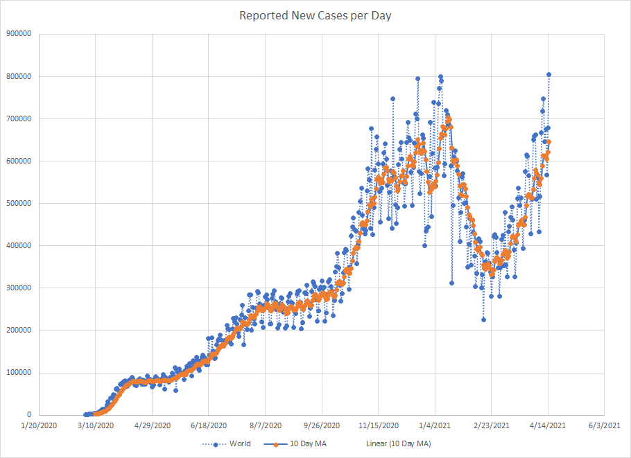
Let’s just start with a graph of worldwide cases. The blue dots are the actual reported numbers and the orange dots are a ten day moving average which hopefully smooths out some of the day to day variability in the reporting. Cases hit a low on February 23rd and have been on the rise ever since. In fact, the number of cases recorded today set an all time high.
One issue with looking at global numbers is that this virus has never acted the same in each country so you have a mix of places where things are declining, places where things are flat and places where things are increasing. You’ll see the graph later but India is currently the biggest driver of new cases.
The following table looks at percentage increase in cases and deaths from March 15th to April 15th. This is done by WHO region which doesn’t exactly correspond to the map. North and South America get grouped into one. Asia is split up among Western Pacific, SE Asia and Eastern Med. And the Eastern Med includes much of Northern Africa as well.
Worldwide cases were up 15% with deaths up 12%. The regions with the biggest percentage increases were the Western Pacific, SE Asia and the Eastern Med. Africa and the Americas saw smaller increases. Even within regions, there is a lot of variability from country to country which we can explore next.
| Cases | Deaths | |
| World | 15.3 | 11.9 |
| Western Pacific | 24.7 | 12.9 |
| European | 17.7 | 12.7 |
| SE Asia | 21.8 | 9.6 |
| Eastern Med | 20.1 | 11.6 |
| Americas | 11.1 | 12.0 |
| African | 8.4 | 7.3 |
I don’t have daily totals by country. What I’ve got is daily number of newly reported cases and my moving average around that. So what I’m looking at is the change in the moving average from mid March to mid April. There are two ways to do this. First, you could look at the change in cases. Or you could look at the percentage change. Both tell a story and both have limitations. For example, the US leads the world in the number of cases by a big margin. So in terms of raw cases, the change looks large. In percentage terms, it has been essentially flat. I’ve tried to use both scales to pick the various places which again is only to give you an example of the type of variation you can see. Which is sometimes why just looking at aggregate numbers doesn’t give you the complete picture. In a world where cases are rising, there are places that are doing just fine.
Africa presents some additional challenges. South Africa is really the only country in the region that has a high number of cases. Plus, the reporting for some countries is inconsistent. They’ll go days with 0 cases and then you get a big dump which is likely cumulative cases over that time period. And this makes it harder for the moving averages to smooth out the day to day variability.
With some allowances for subjectivity, the five places with the biggest increase in cases were Ethiopia, Cameroon, Kenya, Madagascar and Mali. I’ll use Mali as the example.
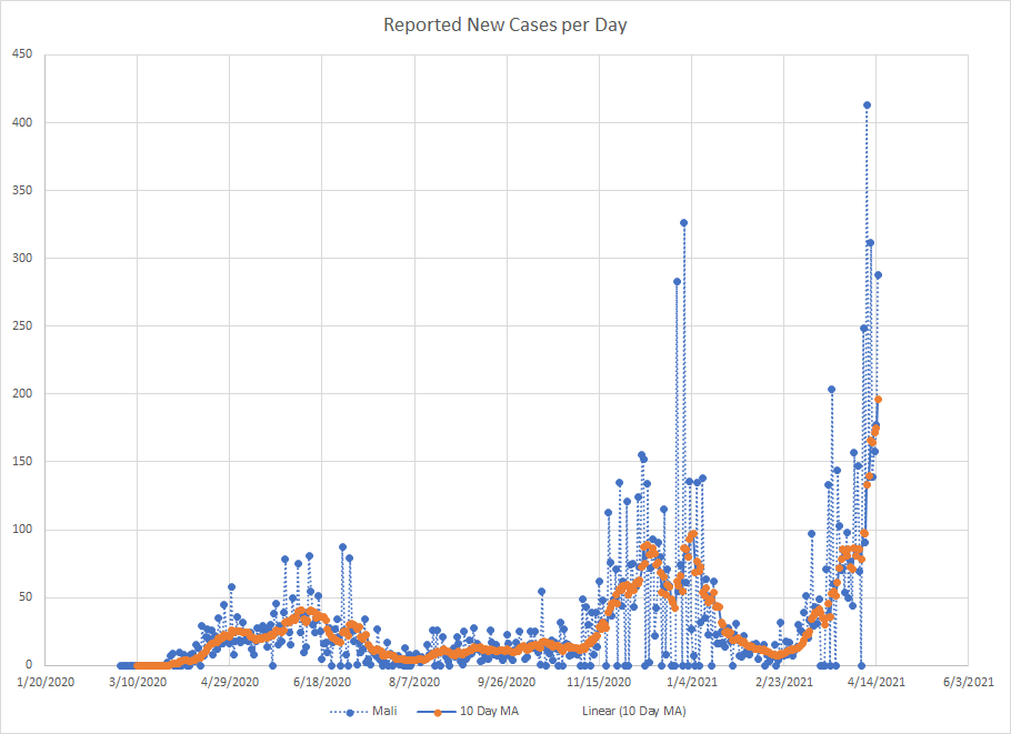
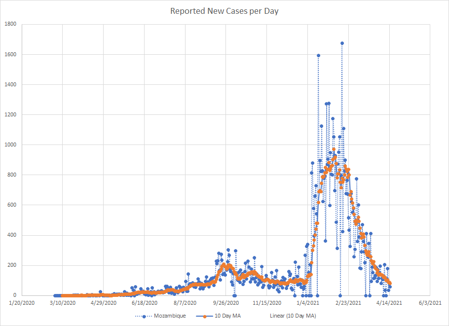
And among the places where cases dropped during this time period are Mozambique, Nigeria, Zambia, Ghana and the Ivory Coast. I’ll use Mozambique as an example since it was one of the places that looked really bad at the beginning of the year and you can see that the wave has come and gone.
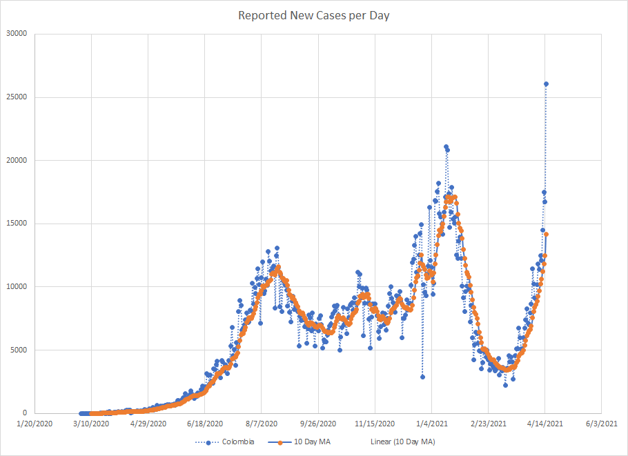
In the Americas, places seeing big increases include Argentina, Colombia, Canada, Uruguay and Costa Rica. Of those, Colombia had the second highest increase in the moving average and also saw it more than double over the time period so I’ll use them as the worst case example.
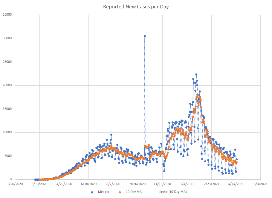
When I last looked at this, Brazil was one of the places showing the largest increases. It looks like the wave peaked in early April and they actually rank first in the biggest drop in terms of cases but that’s also because of the large number of cases. As a percentage, they saw just a small drop. Other places seeing drops include Mexico, Jamaica and Panama. I’ll pick Mexico as the example and the graph just shows that they’ve been in a long decline since late January.
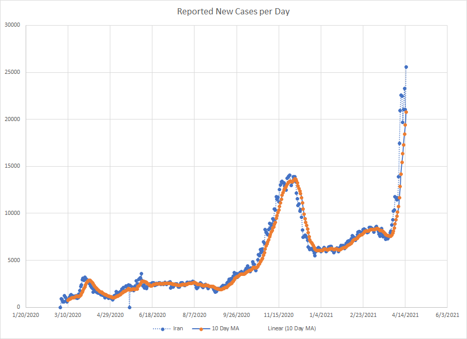
In the Eastern Med region, most of the countries saw an increase. Among the biggest are Iran, Pakistan, Tunisia and Oman. I’ll pick Iran as the example. This is one of those scary graphs. Everything seemed to be fine until late March and then we kicked off another exponential growth phase. Typically, those run from four to six weeks so cases may continue to go up here until at least the end of April which means we may see this graph again when I take another look at the end of April.
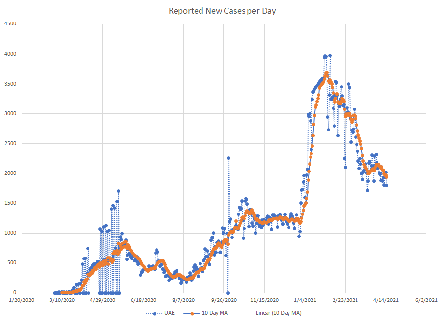
The decliners really include just Jordan, Lebanon and the UAE. I’ll use the UAE because they seem to be pretty far along in vaccinations. They had a wave run from the end of December until the end of January and things have been in decline since although the rate of change seems to have slowed recently.
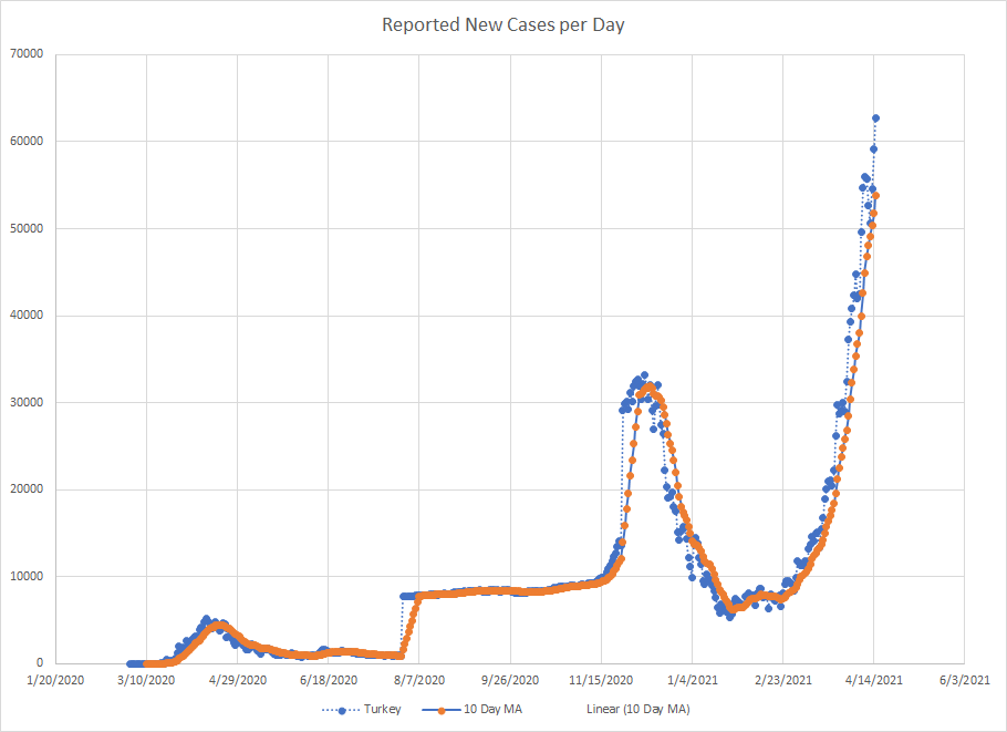
Lots of places in Europe were up the last time I looked at this and many of them still are. France and Poland still rank high in terms of the number of cases but have smaller percentage increases. There were big percentage increases in Azerbaijan, Kazakhstan and Croatia but they rank behind the other places in terms of actual cases. Others that rank high in one or the other include Germany, Ukraine, Sweden and Spain, But Turkey is clearly the worst in this group and they are the example I’ll use. Cases here have been going up since late February which hopefully means the current wave is near the end.
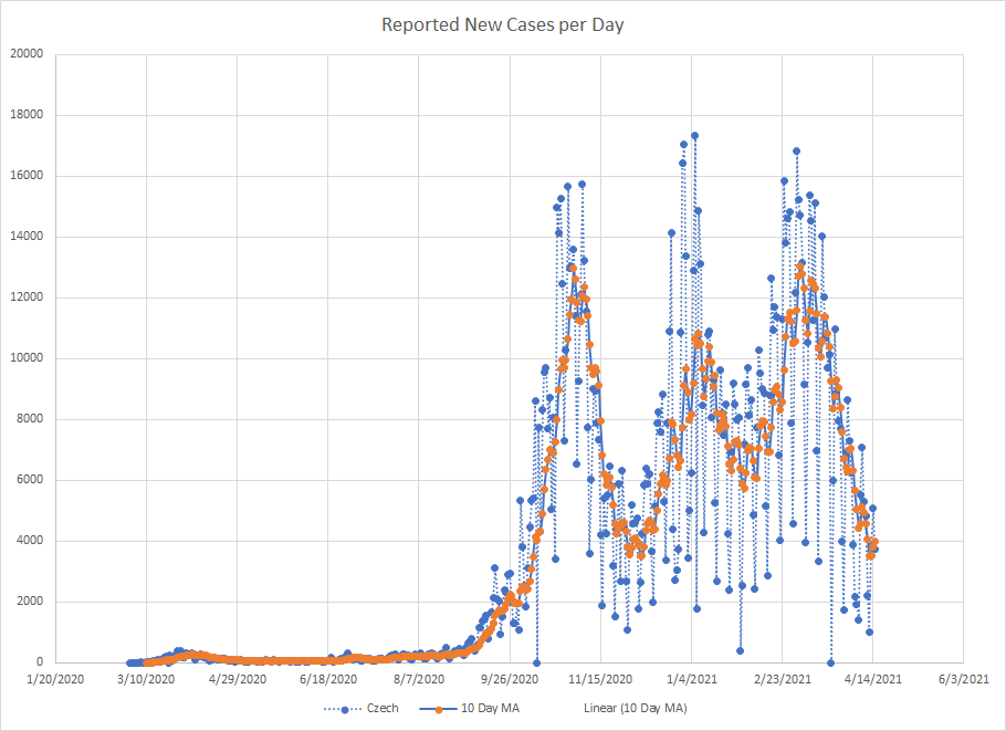
There aren’t a lot of places with really big drops here but among the places with improving conditions are Italy, Czechia, the UK, Hungary, Russia, Slovakia and Estonia. I looked at Czechia last time but they seem like the best example to use here as well. Cases peaked here in earl March and have been on the decline since then.
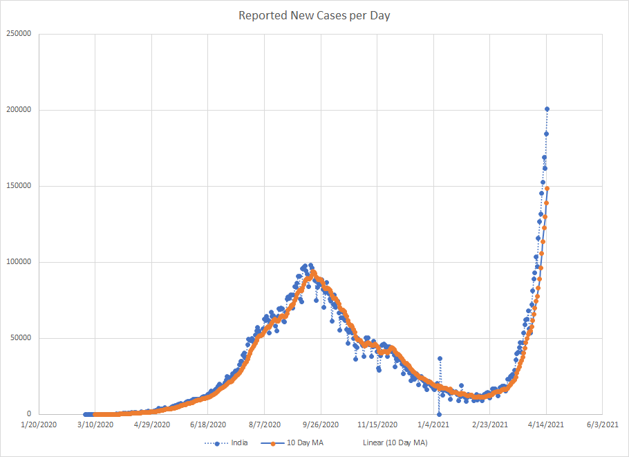
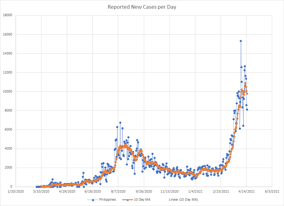
The next two regions are small in terms of countries. In the SE Asia, we had big increases in India, Bangladesh, Thailand and Nepal. I don’t really have a place that shows what looks like a big decrease. And in the Western Pacific, the biggest increases were in the Philippines, Japan and Mongolia and, again, we don’t really have a place with a big decrease. We do have places where the cases are flat or declining but not really by enough to be interesting. I mentioned India earlier and they’ve jumped back over Brazil to take second place in the world for number of cases so I show a graph for them. And I’ll show the Philippines to represent the Western Pacific Region.
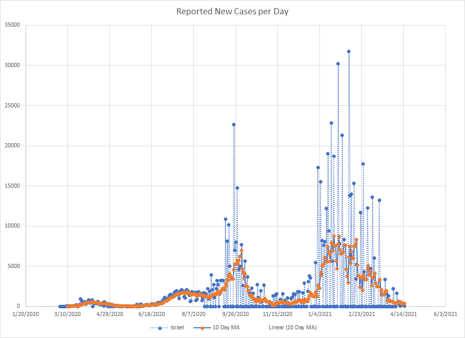
One last graph to show and that’s for Israel. Like the UAE, they rank high in terms of the percentage of people vaccinated. At least according the WHO database. Maybe this is a preview of things to come in other places.
At some point, we would hope that future waves will become smaller and smaller but we clearly aren’t there. Overall, cases are rising in more places then they are falling. We’ll see where we go from here.
