

I think some of this information is getting out into the world. But then I see other headlines about scary variants and even one suggesting we won’t get back to “normal” until 2022. Maybe we’ll be able to have some rational discussions about risk if we do see an extended flat period. How you act when you have widespread prevalence should be different then when you don’t.
Anyway, for the week ending yesterday, there were 9.5 million tests recorded which is the first time we were below 10 million since the first week of November. There were 463,843 positive results recorded which is the lowest number since the week of October 11th. For the week, 4.9% of the tests gave positive results which is also the lowest percentage since that week in October.
For some perspective, the lowest rate for a week was 4.1% back during the week of September 27th. It remains to be seen if we can actually get lower than 4% because, at some point, you run into the false positive rate of the test. I think we could but it would require changing the way things are done. Testing asymptomatic people when the prevalence is low is counter productive because you can most likely end up just finding false positives. Anyway, we are back to numbers that existed at the very start of this last wave.
Newly reported deaths finally dropped last week. We had six straight weeks with more than 20000 deaths recorded but this last week, it dropped to around 13000. As cases continue to drop, this should also continue to drop although the lag in reporting deaths is longer than for reporting cases.
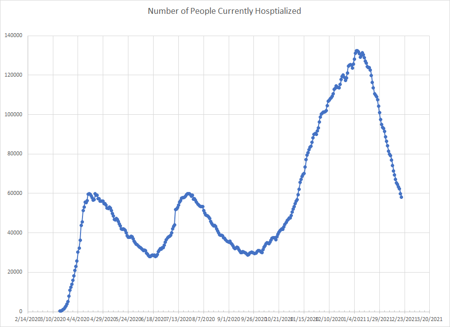
We also continue to see drops in the number of people hospitalized or in an ICU. The graph below is for hospitalizations and the slope of the drop continues to be much faster than the previous two waves. At this point, we are back to levels from the first week in November or about two weeks behind where we are with cases.
The next graph is for people in an ICU. We’d kind of expect this to be similar to hospitalizations and it is. We are back to the levels from the first week in November. There is probably some kind of equation you could derive based on new cases and assuming a certain percentage will end up hospitalized or in an ICU and with some guess as to average length of stay, you could try to model this. I haven’t done that but given the sharp drop in cases the last two weeks, we’d certainly expect these declines to continue as there are fewer people on the front end to replace the ones who leave.

Normally, I would show the set of graphs for the states but I won’t actually update that data until later today. Plus, that source is going away and I won’t be able to update those graphs after March 7th. I’ll show them one last time when we get there but they all show the same trends – everything going down.
Instead, I have a different set of graphs to show. This time, the data comes form the Worldometer site. I haven’t been compiling this as long so it only goes back to late April. What I did was add up the number of newly reported positives by week for each state. I don’t have good information on number of tests from this site and the total number of positives does have some relationship to the number of tests but I think they tell a good story anyway.
The problem with working with cases is that the number vary from state to state based on population so I can’t do the regional groupings I’ve done before. Put California and Alaska on the same graph and you won’t be able to see Alaska. So I grouped the states into seven groups of seven based on the maximum number of positives. Texas and California are bigger than the rest and so I did graphs for each. The graphs are messy but I figured putting nine graphs in a post is better than putting 51. (Remember I’ve got DC in this mix.
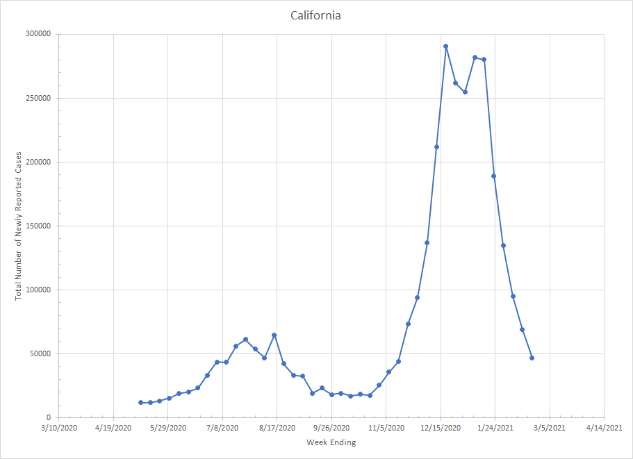
Speaking of California, here is what it looks like. Back last summer, we weren’t running nearly as many tests and I suspect the number of positives would be higher but nothing I can really do about that. You see California had a five week period of high numbers and then things have been dropping since then and they are back to mid November levels.
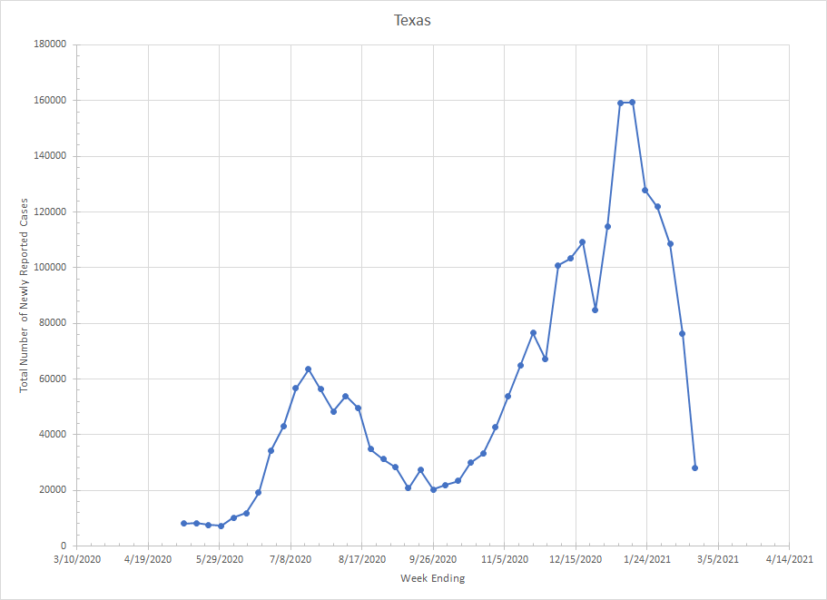
Next we have Texas. I suspect there is some disruption to the numbers from last week because of the weather and power problems. It would not be a big shock to me to see things increase a bit next week because last weeks numbers took a huge drop. Still, they are at levels less than half of what they were at peak.
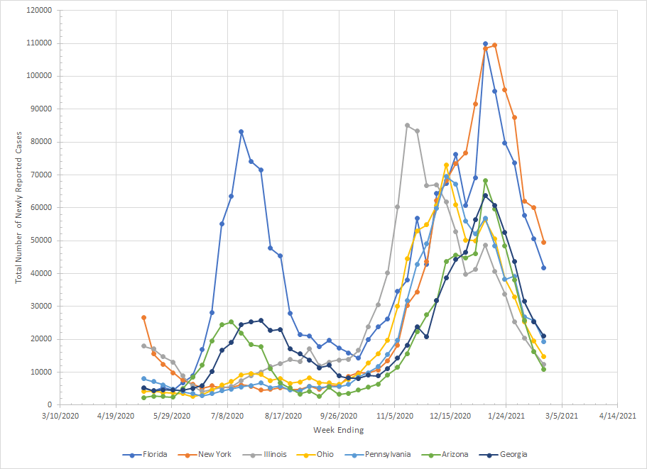
The first group of states includes Florida, New York, Illinois, Ohio, Pennsylvania, Arizona and Georgia. I don’t have data from March/April of last year so you just see the tail of the first wave for New York. Florida was part of the Sun Belt wave in the summer along with Arizona and Georgia. Illinois stands out with a peak in mid November but you’ll see others later. The symmetry of the peaks for most of the states is interesting as a group of them peaked the week of January 9th. All are dropping and have been for many weeks and all are less than half what they were at peak.
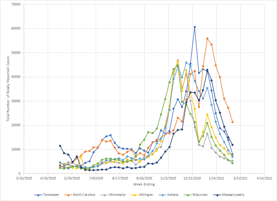
In our next group, we get Tennessee, North Carolina, Minnesota, Michigan, Indiana, Wisconsin and Massachusetts. North Carolina sits above the rest having peaked later and not fallen as far. You can see Wisconsin showing the early rise in the fall as they were one of the first states to be hit by the third wave. There is a pattern that first week in January where all the states came back up but that’s the Christmas disruption since the two weeks before were lower than expected. We really didn’t see a post Christmas surge anywhere – the states that peaked in early January had been rising before then. But all the states here have been falling for several weeks.
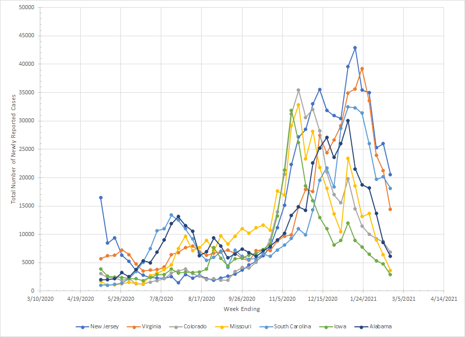
In our next group, we get New Jersey, Virginia, Colorado, Missouri, South Carolina, Iowa and Alabama. Like New York, you only get a hint of what happened in New Jersey back in March and April. You can pick out the states that were hit early in the third wave (Colorado, Missouri and Iowa) and they have fallen to lower levels than the rest except for Alabama. Virginia peaked later than the rest but is falling now. South Carolina is one of the laggards. Cases are falling but they aren’t as far off peak as the rest of the group.
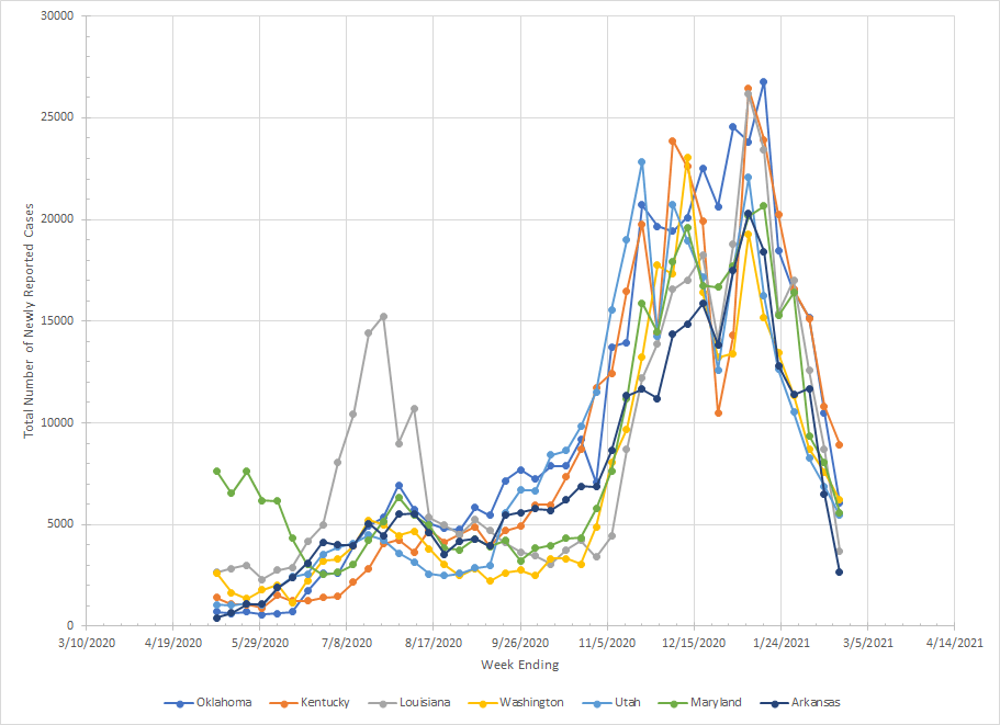
Moving on to the next group which has Oklahoma, Kentucky, Louisiana, Washington, Utah, Maryland and Arkansas. Maryland was hit in the first wave and Louisiana in the second but the rest don’t really show up until the third. Washington did have some early problem but my data doesn’t go that far back. It is interesting that from late September to early November, those three states lagged behind the rest which had started to increase. As a group, all have been dropping quite fast since early January.
The next group has Kansas, Connecticut, Nevada, Mississippi, New Mexico, Nebraska and Idaho. There are only so many ways I can say that all states are seeing big drops in cases. Kansas, New Mexico and Nebraska all peaked first during the week of November 21. Idaho, Connecticut and Nevada peaked in mid December and Mississippi didn’t hit a peak number until the first week of January. In Kansas, Connecticut and Nevada, we did see them remain near peak until January as well. But all have been dropping since then.

The next group contains Oregon, West Virginia, South Dakota, North Dakota, Montana, Rhode Island and New Hampshire. Oregon actually has a little rise in the summer before taking off again in the late fall. The number of cases in North Dakota actually went up last week but I think that’s because they’ve reached an equilibrium and they’ll probably bounce around those numbers unless they decrease testing. The Dakotas and Montana are similar with all being early states in the third wave. New Hampshire has an interesting graph as things didn’t really get started there until early November and they remained near their peak value for seven weeks before cases started to drop.

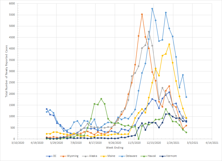
The last group has DC, Wyoming, Alaska, Maine, Delaware, Hawaii and Vermont. Hawaii had their peak in the summer and a smaller spike in late December. Wyoming, Alaska, Delaware and Maine show the typical exponential growth phase with a peak and then a decline. DC did see an increase but it was more slow and gradual. Vermont is just off. They had a very small number of reported cases until early November but the rise has been very gradual and they are only slightly below their peak value in early January.
So that’s where things stand as we start the last week of February. Vermont and South Carolina seem to be trailing the country in terms of how fast cases are dropping. But we are down from peak values everywhere. It doesn’t look nearly so dark as we close up winter and head towards spring.
