

The advantage of using a phrase like “Dark Winter” is that it can pretty much mean whatever you’d like it to mean. We have had a large number of people die from this virus and that may be enough to declare that the winter was “dark”. And, even though cases continue to drop, you could argue that the numbers are still too high. It all comes down to perception since we have no way of really figuring out what constitutes “normal” numbers for a pandemic.
I did see one news story the other day that included a line about “rising corona cases”. I don’t remember much about the rest of the article and I’m pretty sure they just used “rising” because that has been the case since the fall and why bother letting facts get in the way. The truth is that cases have been dropping and every state is past their peak numbers. And things will likely continue to fall unless one of the other strains shows up and is as bad as claimed.
I’m skipping my usual graphs this time around. The end of last year is no longer having an influence on the numbers but we did see a spike during the first week in January which was likely clearing of cases from the end of last year. That week gets washed out of my comparisons next week and then I can probably bring some of the other graphs back. I am going to do some graphs from select states just to illustrate where we stand.
Enough of this, on to the data. For the week that ended on January 30th, there were 12.7 million tests reported which is down from the previous two weeks. The number of newly reported positives was just over 1 million which is the lowest number of newly reported positives since the week ending on November 14th. Positive results (cases) have declined each of the four weeks in January. The percentage of tests that were positive last week was 8.2% which is the lowest since the week of October 31 when we had 6.3% positive. Like cases, the percentage of positive results has been dropping for the last four weeks in a row from a high of 13.6%.
The graph below shows the number of people currently hospitalized with a positive COVID result. The last two days have been below 100000 and we are now back to where we were at the end of November/beginning of December. We are down 27% from the peak on January 12. The ICU graph is similar so I won’t show it.

I tried to do some rankings which is where I started many months ago. Looking at things like weekly change in cases and doubling time. And I’ll just do two graphs per group showing you the ends so you can sort of get a rough idea of how we look across the country. This is going to be cases and I’m showing the raw numbers along with my ten day moving average.
The rankings are arbitrary but it attempts to look at number of cases relative to the state’s history and how fast cases are current growing.
So, the ten best states right now are North Dakota, South Dakota, Iowa, Wisconsin, Minnesota, Alaska, Wyoming, Idaho, Montana and Nebraska. The upper Midwest and Rockies with Alaska thrown in.
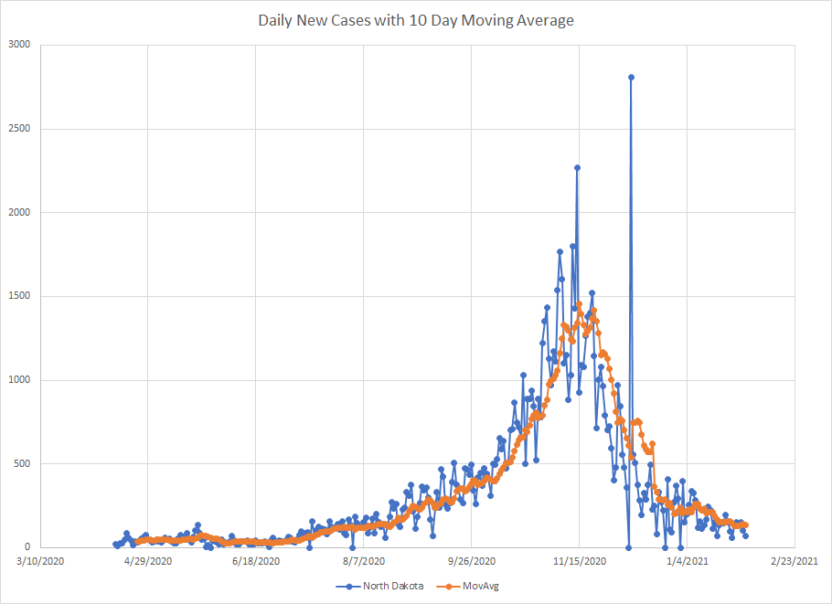
Here is the graph for North Dakota. The rate of decrease has slowed but they also have had several days recently with under 100 newly reported cases. Not bad when at peak they had several days above 1500 newly reported cases.
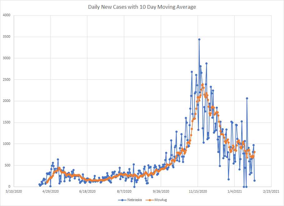
The last state in the first group is Nebraska and that graph is shown below. You can probably see that number of newly reported cases hasn’t dropped as much as it has for North Dakota and the rate of decrease has clearly slowed. But you can also see that we have three recent days with low numbers (ignore the zero’s those are gaps in the reporting)
In the next group, we have Michigan, Missouri, Illinois, Colorado, Indiana, Kansas, New Mexico, Nevada, Tennessee and Utah. This group is still mostly Midwest and Rockies and farther south than the first group. Tennessee is the oddball in the group in terms of location.
The graph for Michigan is shown below. They stopped reporting on Sundays so you get a lot of points at 0 which aren’t real. The current case count is back to early October levels so there is more to go and here is looks like things are still dropping.

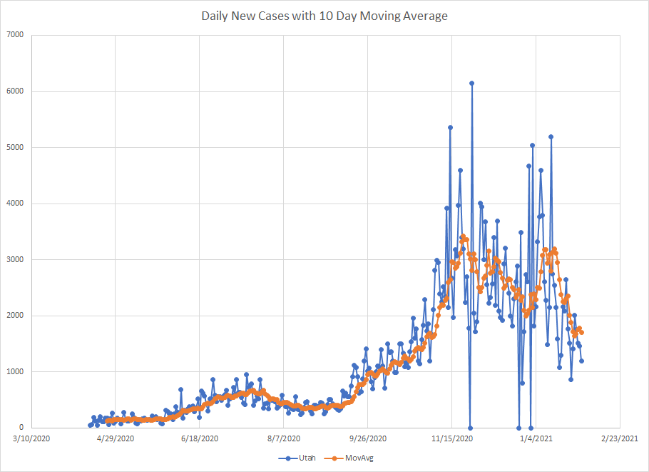
Last in this group is Utah. They’d still be in the top 20 though. In one of my previous posts, I mentioned they peaked in November but came close to that in early January. But once we hit January 15th, cases started to drop and have continued to do so. Again, they still well above summer levels but down about half from peak.
The group of states in the middle are Oregon, Ohio, Hawaii, Rhode Island, Maryland, Arkansas, Alabama, Mississippi, California and Pennsylvania. We get our first New England state and get out to the West Coast. Also move further south to the gulf and get into the mid Atlantic. Also we get the last of the Midwest.
The first state on the list is Oregon. They also have days where they don’t report so you get a zero followed by a spike where they combine two days worth of data. We are only back to mid November levels in terms of cases but are clearly off the peak and moving down.

I’ll do three states from this group. Maryland ranked 25th which would put them right in the middle. Probably the wrong way to think about it but maybe this is the “average” COVID situation right now. You had the double peak which happened in a lot of states that were still peaking during the end of the year disruption. But, again, we get to mid January and things have started dropping.

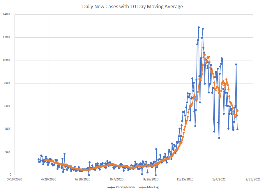
The last state in this group was Pennsylvania just north of the Mason Dixon line from Maryland. On January 29th, they reported 9643 cases which is way above the rest of the data and you can see the spike on the graph below. I didn’t see any notes about why this one day was so much higher and that one day does pull up the average. Outside of that day, things actually look good here but we need more time to make sure that was just a one off.
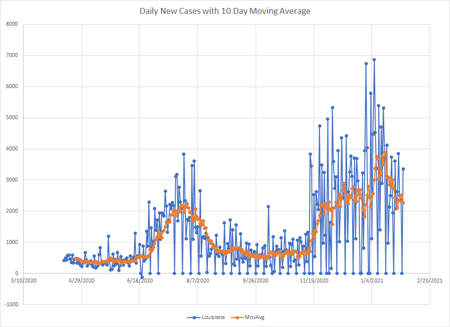
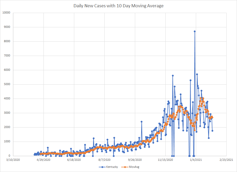
Moving down the list the next group includes Louisiana, Washington, Florida, Delaware, Oklahoma, West Virginia, Georgia, Connecticut, DC, Massachusetts and Kentucky. I put DC in whatever group it fit so there are 11 in this group. More of the deep south and New England plus the mid Atlantic. And Kentucky and West Virginia which I’ve grouped together in my other graphs.
Louisiana is another state that doesn’t report on Saturdays so you get a bunch of days with zero followed by large spikes. The ten day average helps smooth this out. Louisiana was hit hard in the early spring (not shown) and then other parts spiked during the summer. The third wave in the fall/winter is a little muddled but they are off the peak from early January even though it looks like cases may be in some kind of range.
The last state in this group is Kentucky. We get the twin peaks due to the end of year disruptions where there were several days where they didn’t report anything. The large spike on January 2nd obviously contains a lot of catch up. But cases have been dropping since mid January but you can see they haven’t dropped as much as some of the states shown earlier.
Now we get to the bottom of the list which includes Arizona, New Hampshire, New Jersey, North Carolina, Texas, South Carolina, New York, Maine, Virginia and Vermont. Four New England states plus New York and New Jersey. Two border states and Virginia and the Carolinas. It is like this fall wave started in the upper Midwest and then spread out across the country.
The list starts with Arizona. Like other states, we saw a slow down at the end of the year and then cases jumped back up until we hit mid-January when they have started to fall. But the case count is only back to mid-December levels so we are just in the beginning stages of the decline. Still having cases go down is better than having them go up.

Now we get to the “worst” state in the union – Vermont. It really probably isn’t fair because they rank near the bottom in terms of percentage of positive results and the case counts are really low. But it is where they came out so they are at the bottom. There’s a strange saw tooth pattern in the data during the upward climb. Could be they had bigger slow down in reporting at Thanksgiving and Christmas than other places. Similar to other states, they peaked in mid-January and are coming down but are only back to early January levels.

I think my arbitrary rankings turned out OK. There is a clear difference in the patterns between North Dakota and Vermont and you can see gradations as we move across the groups. Cases are declining everywhere. The states that peaked earliest are further along which makes sense.
Anyway, that’s the state on things on February 1.
