

In the interest of being transparent, I’m doing both of these posts on January 1 and then using the future publish date to roll them out a little later. Data is taken from a different source (WorldoMeter) than I typically use but this was the only spreadsheet where I was tracking deaths by day and since that’s part of what I want to show, it required the use of this data set. By and large, I think there are only minor differences between the various data gathering sites.
As a warning, we are going to do graphs for each state plus DC which is why this needs to be broken into multiple posts. We are still dealing with the end of the year disruptions so we could see things start to turn up again in a few places. I don’t want to start using some of my other graphs until we get back into a more “normal” level of reporting which is likely to be another week.
And the usual caveats apply. We do not have perfect data so we do what we can with what we have. Cases are going to be influenced by the level of testing but states are inconsistent in how they report total test numbers and negative results so that causes gaps if you just look at percentage of positive results. Reporting of deaths is uneven and not tracked back to the actual death date. Still we can get a reasonable idea of what is going on.
I didn’t start compiling this data until sometime in May so I missed a lot of the first wave. What I’m plotting are ten day moving average of cases and deaths.
And with that, let’s go to the graphs. Going to start in the Northeast and down the Atlantic Coast.
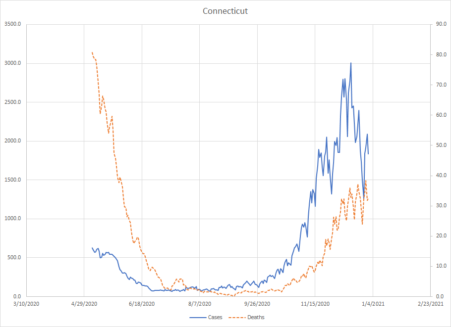
Connecticut – we catch the tail end of the first wave and Connecticut was one of the states with a high number of deaths back then. You’ll see this in other places in this grouping but in this fall wave, deaths have gone up but are not at the levels observed in April. Cases appear to have peaked in mid December. We may see a rise as they clear out the end of the year backlog but they aren’t in the exponential growth phase anymore.
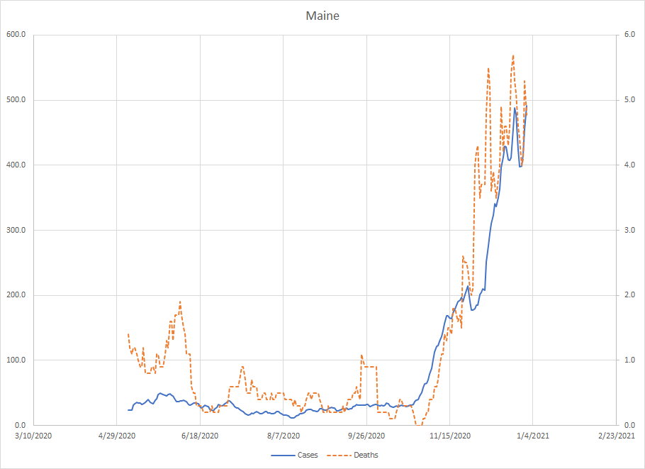
Maine – Should have mentioned this but I’ve let the axis float in each graph so they aren’t fixed. This means all the graphs will take up the entire space but you have to be careful comparing across states because the scales are widely different. Connecticut peaked at an average of 80 deaths per day while Maine is still less than 5 per day. Population differences at play. Maine had kind of sat things out until late October when cases started to climb. With the disruptions, we don’t yet know if the climb is over.
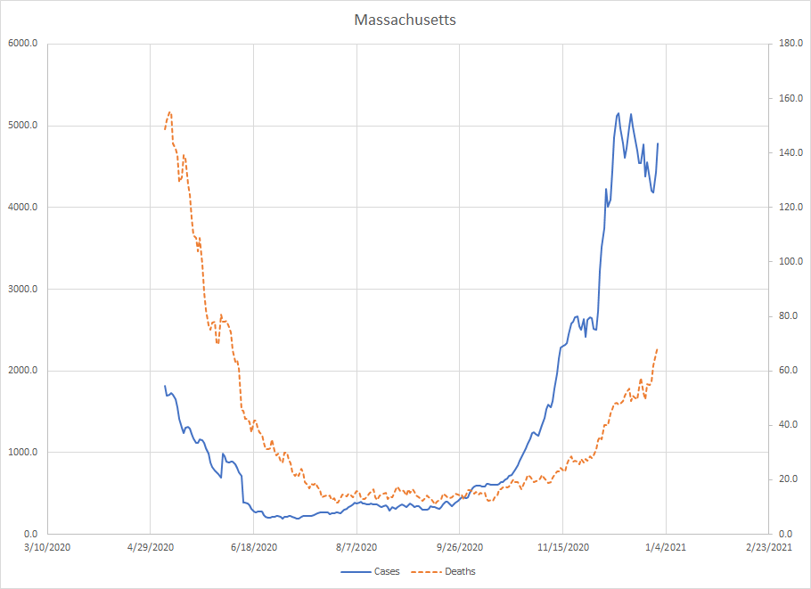
Massachusetts – Very similar pattern to Connecticut. In the spring, we didn’t have the ability to test at high levels which means we were seriously underestimating the number of cases. The graph went sideways during Thanksgiving and then start to climb again. The peak was on December 11th which is far enough away from the end of the year that I think the downturn is real. We may see things go up a bit more but I don’t believe we’ll see a higher peak. This is also an example of deaths lagging cases which isn’t universally true. We do need to see deaths start to fall to really know that a state is on the way down.
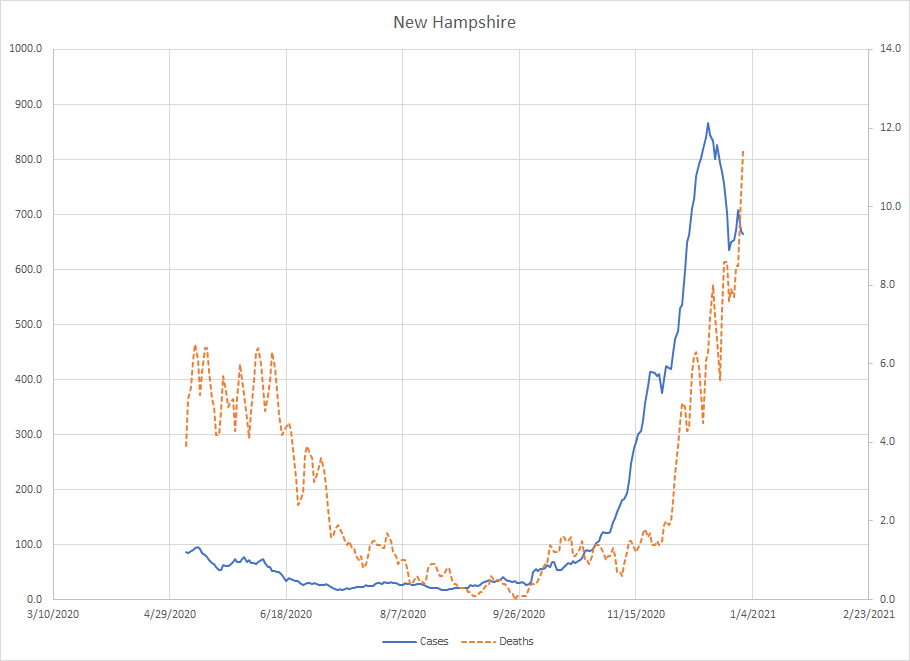
New Hampshire – The death numbers show New Hampshire had some problems in the spring but not as bad as the states in the NYC metro area. Cases started to rise in mid October. The drop at the end is larger than what we saw during Thanksgiving which suggests it is real although deaths haven’t yet peaked. One of the states where we can be cautiously optimistic that the worst is over. (Then again, I’m always optimistic)
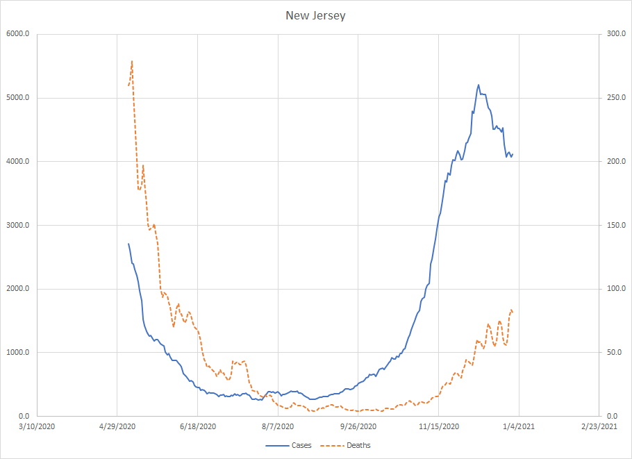
New Jersey – Similar to Massachusetts and Connecticut with a significant number of deaths in April and a lower level now. The average for cases peaked on December 9th, so, even with end of the year disruptions, it looks like the downturn is real. Again, we need to see deaths start to drop to confirm so we’ll put New Jersey in the cautiously optimistic column.
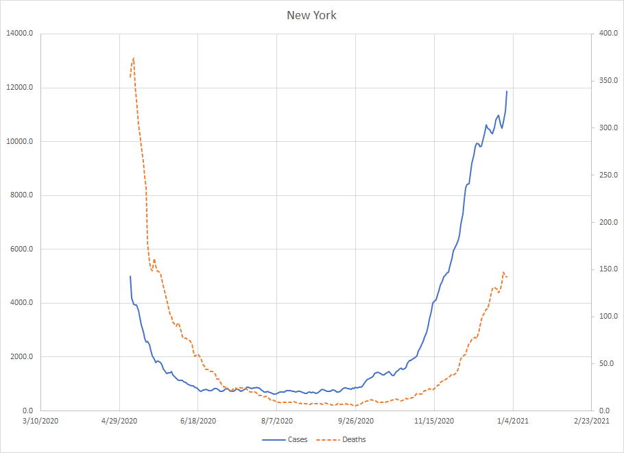
New York – One of the things about doing this is you start to see similar patterns across states which is interesting in its own way. Once again, we have a place that was hit hard in April and has seen a rise in deaths but has not yet approached the levels back in April. Cases are still going up here.
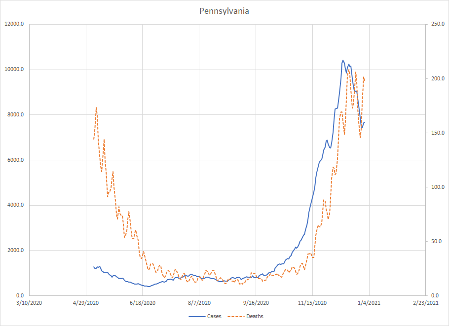
Pennsylvania – The one state in this region where deaths in the fall have passed what they had in the spring. The case average peaked on December 12th. We are not yet seeing a true drop off in deaths although the peaks have been lower. Another place to put in the cautiously optimistic bucket.
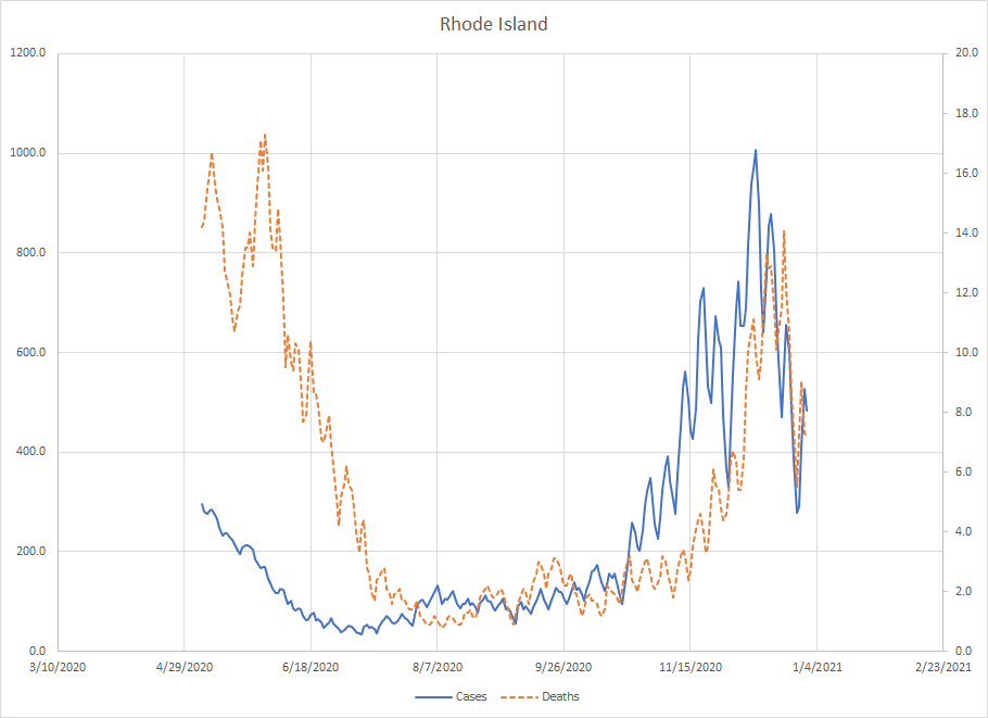
Rhode Island – There are serious gaps in reporting so there might be some big dumps of numbers this coming week. Still, cases peaked on December 11th and the drop is pretty big and we’ve seen the death number drop as well. Because of the gaps, we’ll also put them in the cautiously optimistic bucket for now.
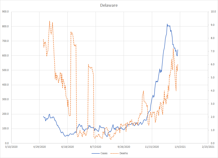
Delaware – The spikes you see in the death numbers in June and July are cases where a state clears a backlog or some lab finally reports after sitting on data for a bit. Like I said, we get inconsistent reporting of deaths and cases and some states were much worse than others. Cases here peaked on December 12th and the current peak for deaths was on December 23rd and we’ve seen lower numbers since then. They also belong in the cautiously optimistic bucket where it appears the worst is over for now.
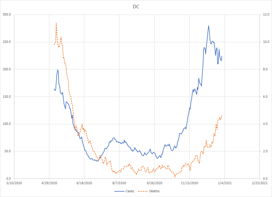
DC – Actually similar to the states in the NYC metro area where the new peak in deaths has not approached the numbers in the spring. The case peak was on December 12th and has come down but the death number is still going up. Again, this is not totally unexpected as deaths typically lag cases so it is another case where we can be cautiously optimistic that the worst is over.
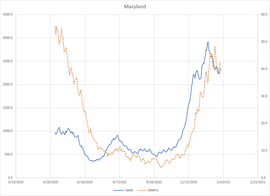
Maryland – Similar to DC and the NYC Metro area in terms of deaths where the levels now have not reached the spring peak. Cases peaked on December 13th and the current peak for deaths was on December 23rd. It does look like things are trending down but we can’t confirm that until we know how much things were disrupted because of the holidays at the end of the year. Like a lot of states in this region, we can be cautiously optimistic that the worst of the rise is over.
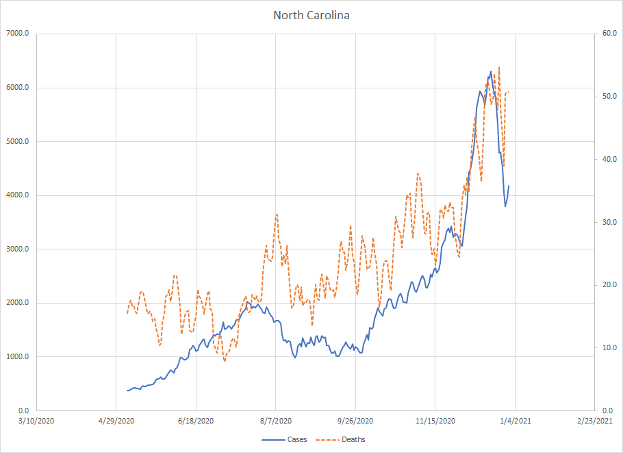
North Carolina – I’ve mentioned before that North Carolina is kind of an outlier. We did see a rise in cases in May but it was more of a slow rise and not the kind of exponential growth that is typically observed. We did get some of that starting at the end of November (after another sort of slow rise starting at the end of September) but then things started to drop off. The drop off seems larger than you’d expect due to end of year disruptions but this is one where we need to wait and see.
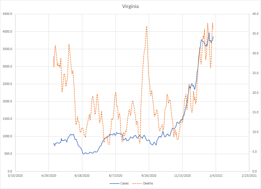
Virginia – Cases started to accelerate here on October 27th. The first plateau is around Thanksgiving and then things continued to climb. They are currently in a plateau as the trends in both cases and deaths are more flat than increasing. In other places, we see that the rise is about two months in length so we could be at or near the end but this is another place where we need to wait and see what happens after the holiday disruptions clear up.
New York is the only place in this group where we haven’t seen evidence of a peak. Maine, North Carolina and Virginia looks to be at the point in the curve where the rise stops but we can’t confirm that because of the possible disruptions due to the end of the year. The other states appear to be heading down. That could always turn around but there is reason to be cautiously optimistic and the worst is over. All in all, it doesn’t look as dark as it did a month ago.
