

Guess this phrase was used in one of the debates. Sounds pretty ominous and scary. Which is probably the intent. Of course, we get less sun in the winter so most winters are pretty dark even without a pandemic.
With respect to the title, I’m not going to make a guess. I don’t know. We do have more of country participating than we did in the second wave even though that included big states like Florida, Texas and California. So does the wave extend longer? Seems like it will. The number of cases is scary but I’ve said before that can’t be the only number you look at.
As always, the bulk of this data is taken from the COVID tracking project which uses volunteers to pull data from the various state websites. I have not independently verified what they pull but I believe it is reasonably accurate. Since there isn’t a single source of truth, data from a different website may yield different results.
For the week ending November 7th, we again hit a record for tests with over 9.3 million run. Of those, 716,043 positives were recorded which is also a record. The percentage of results that were positive was 7.7% which is not close to where we were in the spring but matches the high from the second wave. It is also the fifth week in a row that figure has gone up. In the second wave, this is where the top occurred but I don’t think that is going to be the case here.
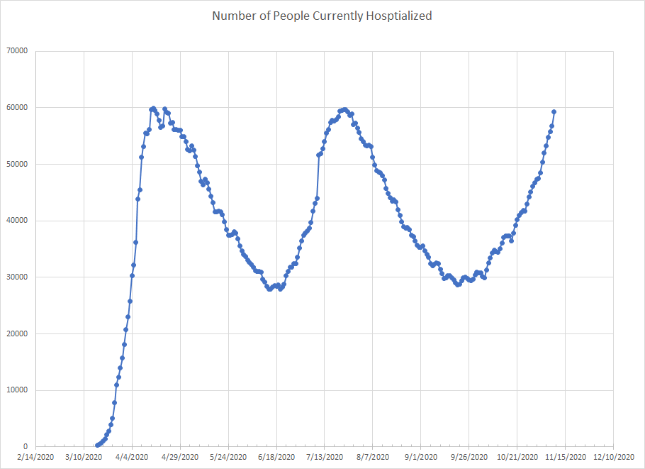
Lots of graphs and we’ll start with the number of people currently hospitalized. This is current through November 9th. Little bit bigger of jump the last day but we had days like that previously and we don’t over react to a single data point. Looks like we will shoot past the peaks of the first two waves. Keep in mind that the first wave really hit the NYC metro area and northeast and the second was in the Sun Belt. This is spread over more states and likely why I’m not hearing stories of overloaded hospitals. I’ve checked a few of the state websites where things are surging and they look to still have capacity. Still looks like the rate of increase is slower than the first two waves.
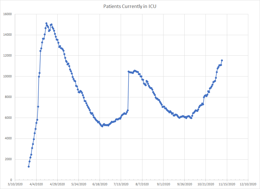
We come next to the graph of people currently in an ICU. We actually had a one day drop before seeing another increase (evidence of why you don’t react to a single data point). One reason for these graphs is to put numbers in context. You could accurately report almost 12000 people in ICUs which sounds scary but it is still under the peak of the first wave. Drawing a rough line through the trend, if things continue as they have, we wouldn’t hit that first peak until mid December which would be a much slower climb than what happened back in April. As I said with hospitalization, the virus is active in more places so even hitting the April peak doesn’t seem like it would overwhelm the system.
I’m also going to copy an image directly from the CDC. This is a weekly summary of things they track to measure the progress and severity of the virus. This only goes through October 31. The red line is the percentage of visits to outpatient providers and emergency departments with COVID-like illness. (ILI is the same but for influenza-like illness). We can see the third wave starting in September but the rise has been slower than the previous two. Would not make much of the drop in the green and grey lines at the end – data takes awhile to filter in. Per this data, we are in a third wave but it has not yet reached levels observed with the other two.

Another source I use is the CDC provisional death count which uses death certificate data and compiles by date of death. It lags other reporting as they’ve currently accounted for 222,190 deaths while the main CDC website shows a total of 237,731 but we can start to see some trends develop. For the week ending October 3rd, there were 3665 deaths with COVID listed on the death certificate and the numbers have been increasing since. In the second wave, deaths peaked six weeks after the low in last June. It will take several more weeks to fill in enough data to really be able to compare but the second wave had a five week stretch with over 7000 deaths per week with two weeks over 8000. Right now, the numbers are at 4000 but not all of the deaths have been tabulated.
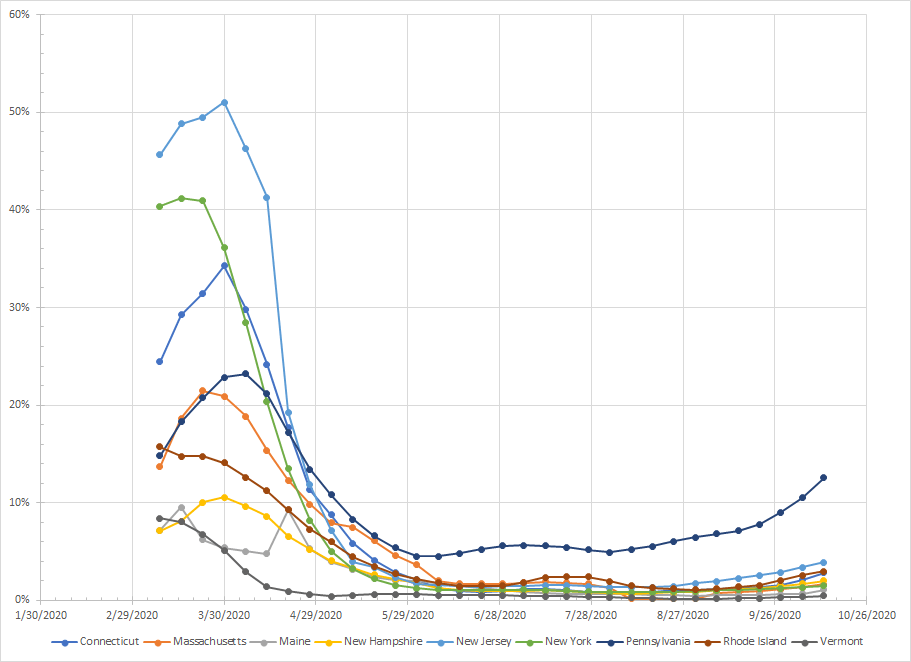
I’m going to risk boring you with more graphs but I’ve got a few that I found interesting. For each state, I’ve compiled data going back to early March. To smooth out some noise, I’ve calculated a rolling four week total so each data point you see on the graphs below represents four weeks of data. The points are plotted at the beginning of the rolling period which is why the curves stop in mid October. Just know that the last point represents the most current four week period ending on Sunday. What I’ve plotted is the percentage of tests that were positives which helps normalize things since the number of tests is much higher than it was back in the spring.
The first graph is for the Northeast. It is hard to see with the scale but all of these states have shown an increase but Pennsylvania is really the only place where it looks problematic. I think with recency bias we tend to forget how bad things actually were back in March/April. New York had 54,750 positive results last week. At their peak in late March, they had 228,532. In New Jersey, the numbers for last were were 40,967 vs a peak of 95,652. In Massachusetts, last week they had 32,496 positive results vs a peak of 52,412. Not to minimize the number of cases which is not trivial but what is happening now is this region is not close to what happened back March.
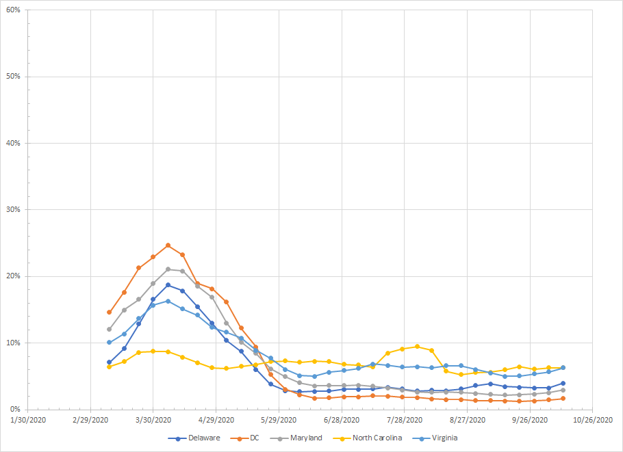
Moving down the Atlantic a bit, we have the next group of states. North Carolina shows a flat line which is just odd but there are other places that are similar. The other states in the region also were part of the first wave but did not hit the same peaks as the Northeast. Right now, they aren’t part of the third wave as they’ve shown no real increase in positive results.
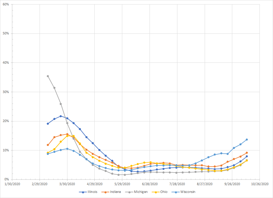
Jumping around the country, we get to the big Midwestern states or the Rust Belt. I live here so I can say that. All are trending upwards and at rates that are higher than in the Northeast. You see the small bumps in March right as things started shutting down. Wisconsin had the smallest number of positives back in March and it is currently the worst of the group. Things have been rising in most places since late September so this is a place to watch.
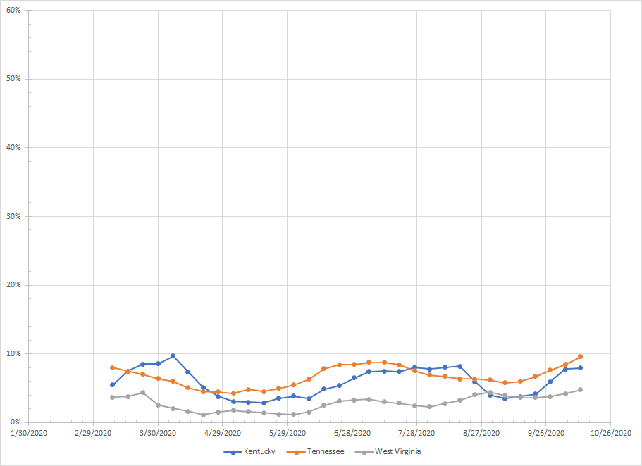
I’m kind of going North to South and East to West so next we come to a group of three states that also show flat curves like North Carolina. It leads me to think there is some geographical thing helping to explain the spread of this virus. The outlier is Virginia which is in the same general area. I could speculate that Virginia follows DC since a lot of Virginia lives near DC and DC naturally gets people from all over the place so stuff is going to spread there. Anyway, I just found it interesting.
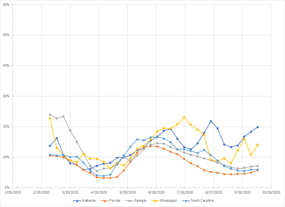
Next we move to the Southeast. Alabama and Mississippi kind of bounce around but you don’t see a consistent trend. Florida, South Carolina and Georgia are not showing an increase at this time. Another region that is kind of sitting this wave out.
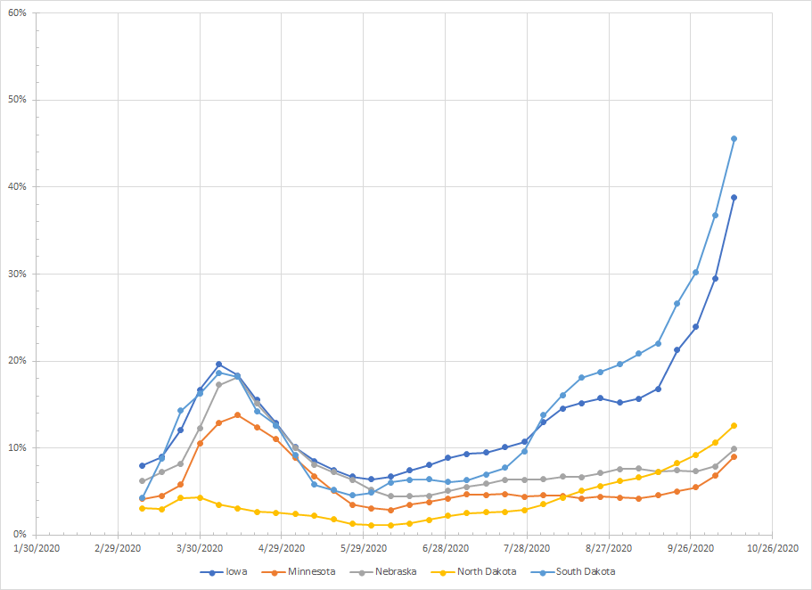
Let’s go back north to the upper plains. Four of the five states did see a peak in March. The numbers for Iowa and South Dakota are kind of ridiculous. I’ve heard some places no longer count all of the negative results which might be the case for those states. The numbers are rising in all places. Iowa and the Dakota started earlier but it looks like Minnesota and Nebraska are starting to see a rise as well.
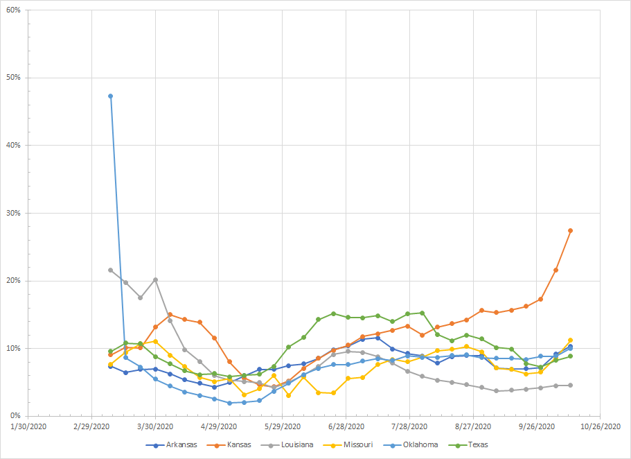
We move down and I’ve tossed Texas and Louisiana into the next group even though the patterns don’t match. Kansas is like Iowa and South Dakota. Louisiana had a big peak in February (Mardi Gras) and a smaller one during the second wave and is now flat. Texas was in the second wave and is also flat. There might be a trend in Missouri but Oklahoma and Arkansas look flat. Kansas is the only one of the group where there is a clear upward trend.
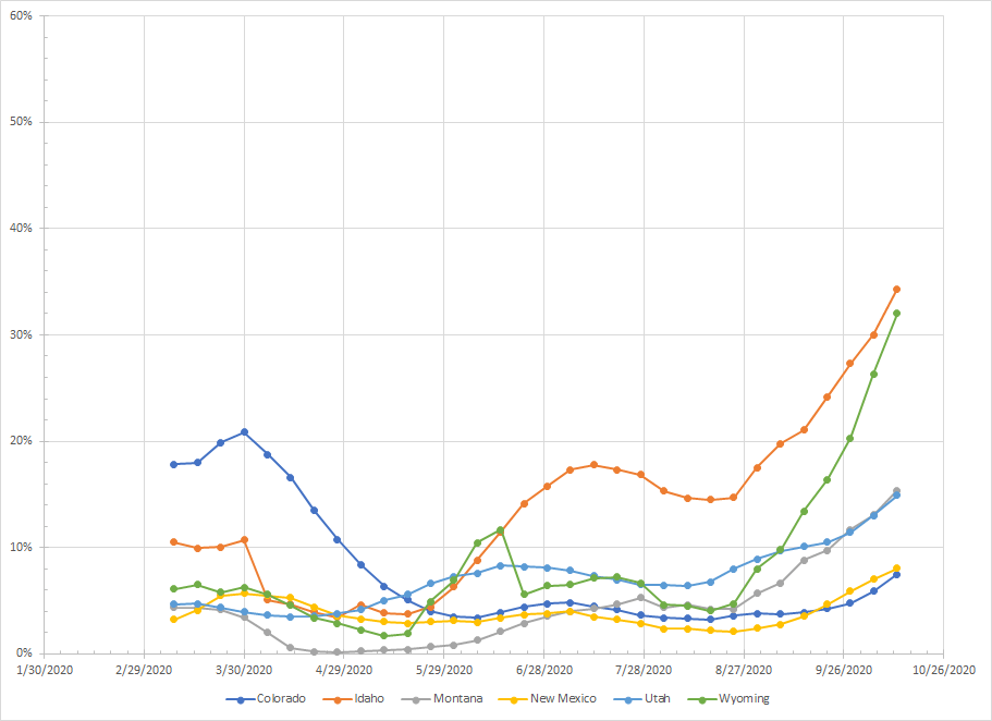
And next we move to the Rockies. Interesting that Colorado was really the only state with a high peak of positives back in March and they are still below that peak even though the percentage has gone up lately. New Mexico was flat until recently when things have started to go up. In the other states, you see the big increases. Cases up in all but sharpest increase in Idaho, Montana and Wyoming.
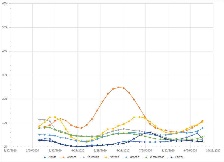
I just tossed the rest of the states together even though they aren’t alike at all. You see the big peak in early summer for Arizona and smaller peaks for Nevada and California. We see cases on the rise in Arizona and Nevada but flat in California. There’s a peak for Hawaii in August but they are flat now. Washington and Oregon have been essentially flat although each ticked up a bit in the last time point. Alaska didn’t really show anything until September – I don’t know how real the last point is but they’ve also never had a significantly high percentage of positive results. Any increases here are much less than in the Rockies or Upper Midwest.
You could look though the data and make accurate statements about where case count or even percentage of positives is going up. If you just did a raw count of states, you’d find more that are going up which starts to look dark indeed. I’m just trying to put some of this in context. What is happening in Wyoming is different than what is happening in Illinois which is different than what is happening in New York.
And since I have too much time on my hands, I’ll keep watching.
