
Quick search of headlines and I find many articles breathlessly talking about a “surge” in new cases. Or places where cases jumped by some high percentage. To be clear, there does look to be an slight uptick in certain places although it is really hard to know if it rises above the false positive noise of the particular tests they are using.
I did download data on testing complete through Sunday and have put together a whole bunch of graphs to look at various places. My other rankings relied on raw case count and I find that it is still a decent stat to use though not perfect. If I look at the states where positivity is climbing, there is a lot of overlap with my worst group of states.
But there are a few places where the rise in cases is primarily due to massive increases in testing. Again, if you test twice as much and find twice as many cases, the underlying prevalence of the disease is unchanged. And the extra cases you find are not worrisome. Here is the first example of the graph I came up with – this is for Connecticut.

Going to take a little time to explain this graph. What you see plotted are the reported weekly totals for tests and positive results. The date represents the start of the week so the last data point is for the week that ran from October 5th through October 11th. To make the graph readable, I’ve used different scales – the left axis is the scale for the number of tests and the right axis is the scale for number of positive results.
It is not as clear as plotting percentage of positive results but I wanted to just deal with the raw counts since that is what people are focused on. You can get a rough idea of percentage of positive results by looking at the top of each axis. In this case, we have 9000 positives and 180000 tests which works out to 5%. (The scales on each state were set randomly, so this will fluctuate). When the blue line is above the orange line, the percentage is greater than 5% and the reverse is true when the blue line is below the orange line.
Anyway, in this case, you can see the Connecticut has seriously ramped up testing. The last two weeks represent the highest number of tests ever done and you see a corresponding uptick in the number of positives. It is factually correct to say that the number of positives is the highest since early June but that doesn’t put the number into the proper context. The “surge” in Connecticut is primarily an artifact of increased testing.
If you want a counter example, here is what Montana looks like. Some of what we were seeing in September was related to increased testing but, in this last week, the blue line crossed over the orange line showing a large increase in the percentage of positive results. There was a previous spike in testing that found less than 1000 positives. In the last week, the number was over 4000. This is why Montana is last on the list.

Want to spend a bit of time on the four states that hit new peaks but where those peaks were really driven by testing. First up is Colorado. Again, it would be factually correct to say Colorado saw the largest number of new positives last week. It is also true they performed the most tests last week. Colorado had three weeks back in July where the percentage of positive results was around 5%. Since then, it has ranged from 2.9% to 4.4%. Not a sign that the disease is really increasing there.

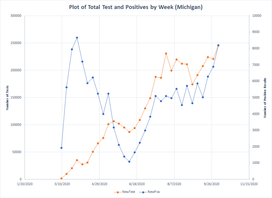
Next up is Michigan. This data set goes back farther than the one I’ve got for my rankings but I don’t want to go back and retrospectively fill in March. Michigan really isn’t at a new peak because cases were still higher in March. The gap between the lines has closed a bit but since July, the percentage of positive results has ranged from 2.1% to 3.3%. The last week was the highest at the 3.3% so there might be some truth in the increase. Still, even if the raw number of positives is close to what it was back in March, the two situations are not comparable. What we see now is far less worrisome.
Next we come to Minnesota. Starting in mid September, they cranked up testing and the number of positives they found tracked right along. Yes, the last point shows the blue line above the orange line but, over those last four weeks, the percentage of positive results was 4.4%, 4.7%, 4.3% and 4.9%. No strong evidence of a trend. In fact, since early July the percentage of positive results has ranged from 3.3% to 5.4% so these values all fit within that range. The number of positives is up but not because the disease is more prevalent.

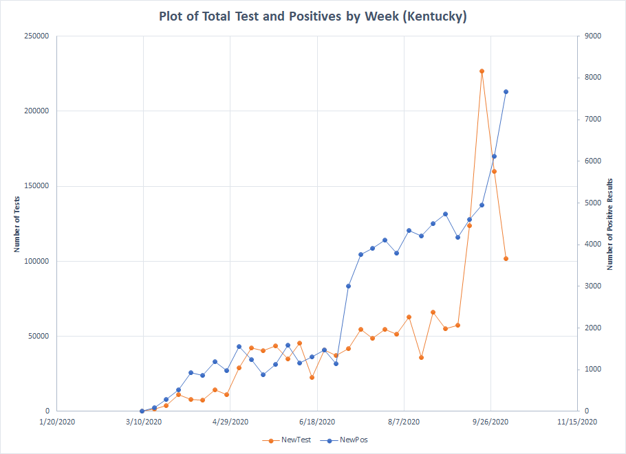
The last state on this list is Kentucky and the pattern here is just odd. Over the last eight weeks, the percentage of positive results has been 11.7%, 6.8%, 8.6%, 7.3%, 3.7%, 2.2%, 3.8% and 7.6%. Is it possible that Kentucky saw a real decline and has now bounced back up again. Possible but it doesn’t fit the type of patterns we see elsewhere. When you aggregate testing data over a whole state, you have to assume that there aren’t any underlying skews in the data which may not be the case. Was the spike in testing primarily from one location where the prevalence is lower or from a patient collective where it is lower? Things like that that you can’t know unless you can break the data down into fine chunks. It wasn’t possible to do that from the top line summaries I had. But the data from last week isn’t really different from the data back in August – just more tests leading to more positives.
I probably could have tossed Oklahoma into this bucket as well. Three of the last four weeks have had the highest number of tests and positive results but you can see that the orange and blue lines have basically been parallel to each other since back in late July. Over that time, the percentage of positives has ranged from 7.8% to 9.8% with no evidence of an increasing trend.

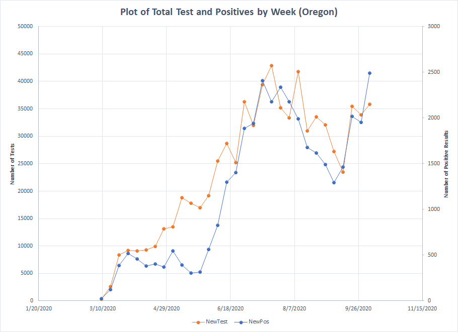
Toss out two more places that hit a new high in positive cases last week. First is Oregon. I think this is another media tactic – focusing on new highs. The real problem with that is a single point does not make a trend. Last week, the percentage of positive results was 7%. Going back to June, that percentage has ranged from 4.6% to 6.6%. Is 7% significantly outside the established range? Could be but until we get a couple more weeks in, we won’t know for sure. Never overreact to a single data point.
The other state is New Mexico. Like Oregon, you don’t see the type of peak you see in other places where the blue line is far above the orange line. In terms of cases per million, New Mexico ranks 39th and Oregon ranks 48th so you could say neither place has been hit particularly hard. Like Oregon, the lines have basically run parallel to each other and we only see the blue line break out last week. In terms of percentages, last week was 5% which is higher than it has been in the past but only by a percentage or two. Like Oregon, we have to see what happens over the next couple of weeks to know for sure.

Places where there is clear evidence of increasing cases are Alaska, Iowa, Idaho, Indiana, Kansas, Montana, North Dakota, Nebraska, South Dakota, Utah, Wisconsin, Wyoming and maybe Missouri.
Other places where the increase is driven more by testing are Arkansas, Connecticut, Illinois, Massachusetts, Maine, New Hampshire, New Jersey, New York, Ohio, Rhode Island and Virginia.
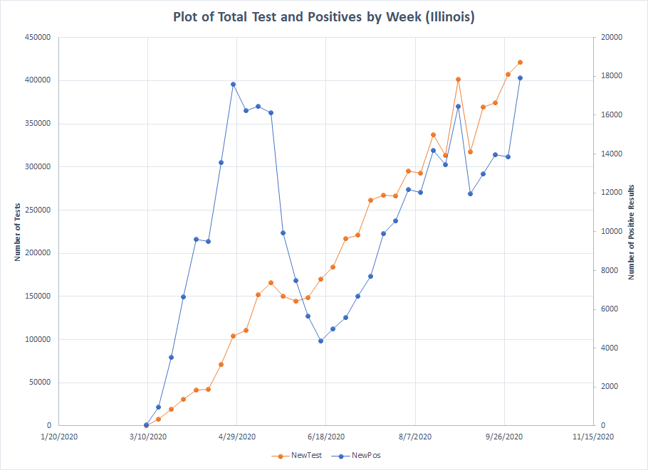
I won’t do all of those graphs. I’ll just pick a couple of examples. First, here is Illinois. Both testing and positives have been on a steady increase since mid June but the two lines have remained mostly parallel indicating no big increase in the percentage of positives.
I’ve covered New York before but it makes for a nice graph because of the contrast to April. Yes, the last two weeks show a jump in the number of positives but they also correspond with the highest number of tests.

I think I’ll stop with graphs here. Just to make it clear, there is a pattern in some of these states where the percentage of positive results may be trending upwards. But if New York goes from 0.9% to 1.3%, is that really a surge or even a problem. If hospitals still have plenty of capacity, I would argue it isn’t really an issue.
Just a couple of takeaways. First, you should never over react to a single data point. Second, reporting number of cases without also talking about tests is misleading. Take any report that speaks to something hitting a new high with several grains of salt if they don’t provide the needed context.
