

I’ve mentioned before that I’ve spent a lot of time looking at various ‘rona numbers. Can’t help it. Data analysis is kind of part of me. Now, just because I feel like it, I’m going to share a few graphs. I think this is an introvert thing (or maybe just INFP) where we spend a lot of time doing stuff but never share it with anyone.
As a disclaimer, all numbers are taken directly from WHO situation reports. These rely on the various countries and I can’t speak to the accuracy or issues associated with them. To start with, here is a graph I showed about a week ago.
The upward blip a couple of days ago was because Kyrgyzstan added 11883 cases. I think these were considered potential or it was a catch up from past data. That happens from time to time when countries do a data dump cleaning up stuff that hadn’t been counted before. As a reminder, the lines are plotted on different scales so you can actually see the trends. It is too early to really consider this a trend but the number of new cases has basically been flat since July 10.
And, as a caveat, this is looking at worldwide numbers which are going to be influenced by a few places and certainly does not rule out outbreaks in other places.
Here are some details for some of the countries with the largest number of cases. I was only tracking new cases so I don’t have death information by day for any of these places. To better illustrate the trend, I include a 10 day moving average. And, for now, I’m skipping the US. I think that’s the subject of another post but we need more time to see what is really happening.
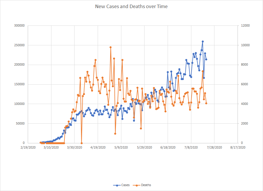
Brazil – currently reporting 2098389 cases with 79488 deaths (3.8% CFR).
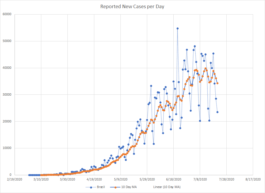
Lots of day to day fluctuations in the number of cases which is why the 10 day moving average is useful. The number of new cases has essentially been flat since around July 4. It is flat at a very high number of new cases which could still present problems. But flat is better than continuing to increase.
India – current numbers 1155191 cases and 28084 deaths (CFR 2.4%)
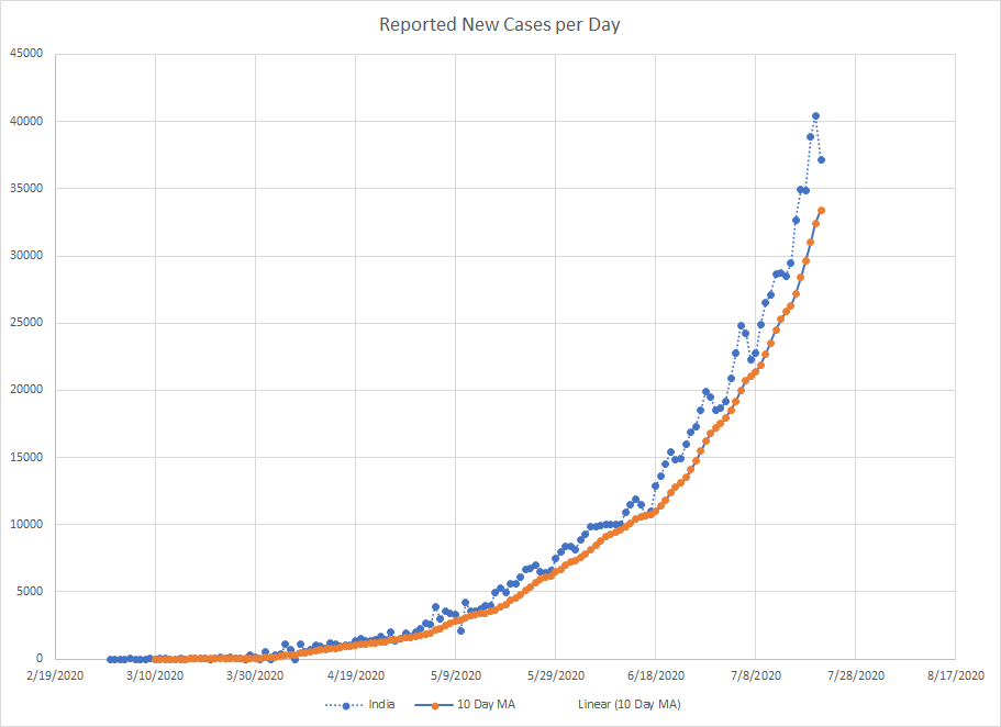
This is not what you want to see. Not going to pay much attention to the drop at the very end unless we see several days of that. We really need to see the 10 day average catch up to know that the rate of increase has slowed. Given the large number of cases, this is probably the hot spot in the world right now.
Russia – currently with 783328 cases and 12580 deaths (CFR 1.6%)
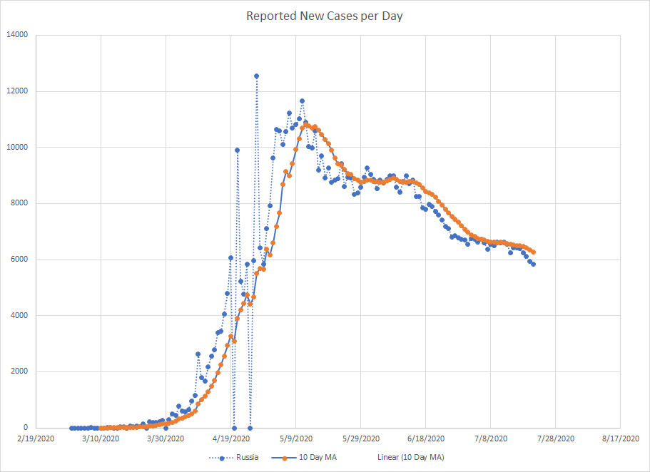
In a lot of countries, we see the same increase pattern – the number of cases looks like it is going to expand exponentially but then it eventually levels out. The pattern in the decrease seems to vary. Some places have a sharp drop and some, like Russia, just take forever. The number of new cases peaked in early May but they are just now getting a daily level that is half the peak. The stair step downward pattern is a little odd. The potential good news is the last couple of days are showing a downward trend so this could mean they are going to get out of the plateau and start trending down again.
Those are the four places with the largest number of cases.
South Africa – currently with 373628 cases and 5173 deaths (CFR 1.4%) Would really like to understand the differences in CFR. Different treatment regimes? Better control over vulnerable populations. I don’t know if anyone is gathering this data but they should be.
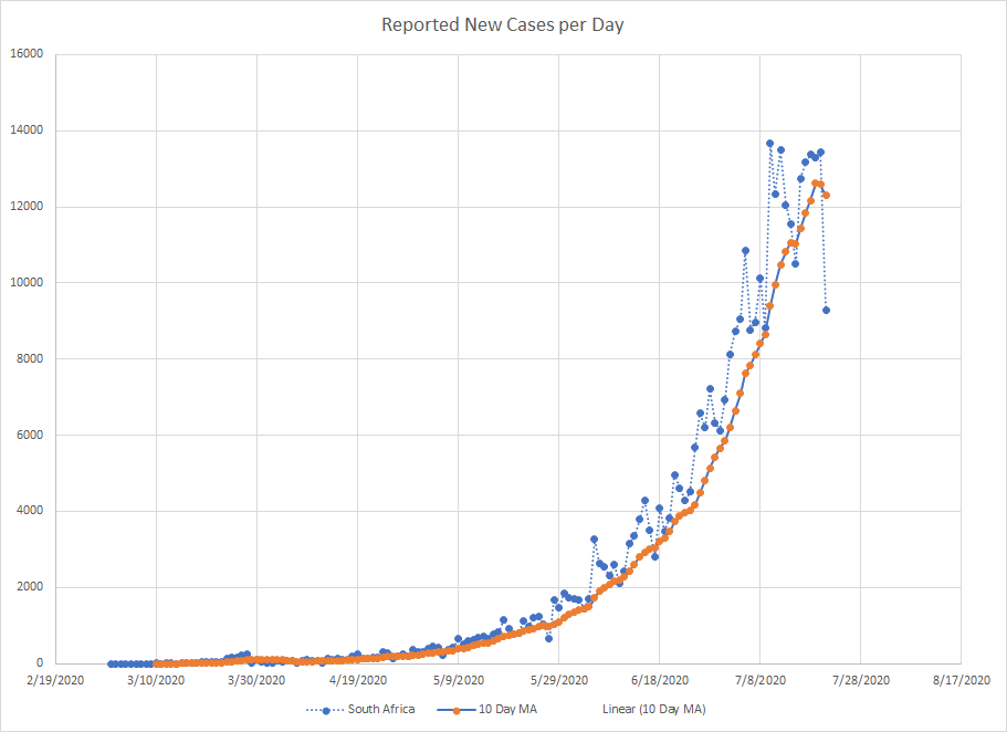
It gets lost in the data but South Africa had a very small increase back in late March. Then, everything was flat for about a month until it started taking off. Just to put that rise in perspective, on June 1, South Africa ranked 28th in the world for number of cases. Today, they rank 5th. Given that they would need to double their number of cases to pass Russia, I don’t see them going any higher. We have evidence that the number of new cases is no longer increasing. The 10 day average has turned down which is a good sign. Need more time to know if the worst is over.
Peru – currently with 353590 cases and 13187 deaths (CFR 3.7%)

This graph gets distorted by the one day dump back in May so it is hard to see the patterns. Cases are down from the peak but the last couple of days suggest things are starting to go up again but at a lower rate.
Mexico – currently with 344224 cases and 39184 deaths (CFR 11.4%)
Mexico is kind of an anomaly. The case fatality rate is the higher than other places in North and South America and looks more like the countries in Europe that were hit hard. Why? I wish I knew. Maybe it has been discussed but I don’t think there is yet a lot of hard science trying to understand things like this.
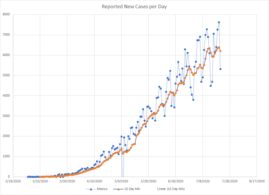
Lots of day to day fluctuations in the reporting. It is possible that they’ve hit peak but the number of new reported cases hit an all time high on July 20 so ?I don’t know if I can say that. They had a period back in late June that looked like a peak but then things broke out again.
Chile – currently reporting 333029 cases with 8633 deaths (CFR 2.6%)
There has been lots of speculation regarding the seasonality of the ‘rona. Given that we have Chile and South Africa on the list, there might be something to that.
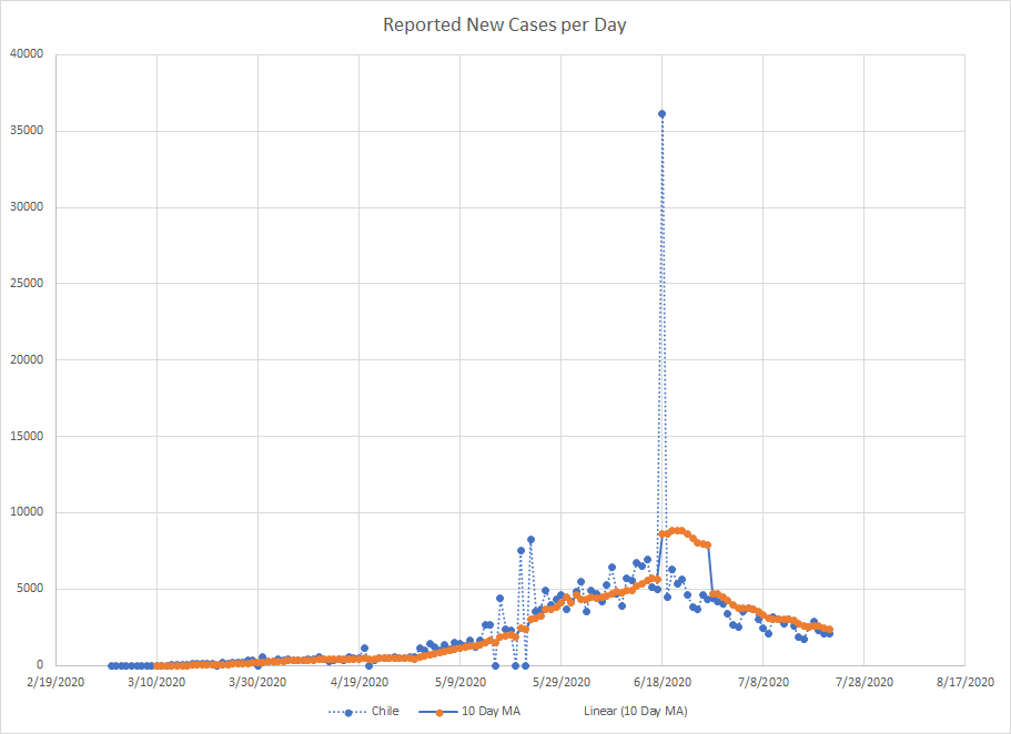
Another country where we got a very large one day dump of cases making it harder to really seen the trends. But the pattern is certainly decreasing and has been since around June 20. This does look like a place that is past the peak.
UK – currently with 295376 cases and 45312 deaths (CFR 15.3%)
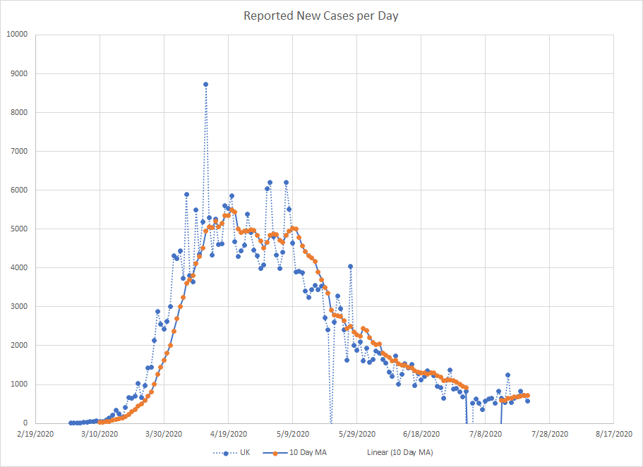
The UK made a correction to their numbers which took about 30000 cases of the total. The WHO showed that as a negative number and I didn’t try to correct it which is why the 10 day moving average line disappears for a bit. The peak in the UK lasted about a month and they’ve been in a decline since then.
Iran – currently at 276202 cases and 14405 deaths (CFR 5.2%). I’ll close out here. Just to cover the top 10 in the world right now.

Another country where we see a large one day correction in the number of cases. Iran was hit hard early in this pandemic. Cases where dropping until early May when we see what looks like a second wave. Most of the countries in the Middle East were experiencing increases at that time as well. The curve is flat but has been at this plateau for over a month. Like I said with Russia, the path down from the peak seems to vary quite a bit.
So that’s what I’ve been doing with some of my spare time since this started. I know I’m a geek but I’m not working and there were no sports to follow and there are only so many walks the dog can take. So I play with numbers.
Closer to home, the suburb just north of us instituted their own mask last starting on Friday. Guess I’ll be wearing one when we go shopping on Saturday. Sigh. They also are requiring them in gyms but make an exception if you are exercising in a small group outside. Understand the logic but don’t like that it goes against the WHO recommendation. I had been considering going back to the gym on a limited basis but that’s off that table now. Will continue to work out at home with no mask.
The dance studio is in another suburb that hasn’t gone this far … yet. I’d have to reconsider lessons if they made the mask mandatory.
I get the panic because we are in a second wave right now. But, while the number of cases matches where we were in April, the number of deaths does not. And there is plenty of capacity in the hospitals. I suspect this second wave burns itself out soon but that will be just in time for people to claim the masks made the difference.
I’ll end it here. Did this a little early today but we have rain and storm around so it is not a good day to be outside which is why I’m inside making graphs. Such a fun and exciting life I lead.


End of week postscript – Today there were a record number of new cases reported. And the number of new deaths was the highest since April 30th. Despite that, the CFR didn’t change significantly – small bump in Africa. Both Brazil and South Africa saw higher numbers of new cases so they don’t look so flat anymore. We keep watching.