

As we close out another month, here is the overall graph of new daily cases with the ten day moving average. The rise that began at the end of February continues and the daily total of new cases has gone beyond the numbers in fall/winter when the US was the primary driver. Brazil and India have been the drivers for this rise with India being the cause of most of the recent rise. They have now moved past Brazil and back into second place for number of cases. (Per million people they don’t rank as high).

For perspective, if the current rates would continue, India would pass the US in 46 days which just goes to show how far above the rest of the world the US is. It does look like the rate of growth is slowing but that is likely due to other places besides India. There were several places that saw cases peak in April and then start to decline.
The table below shows increase in cases and deaths for the month of April. All data comes from the WHO as does their classification. Worldwide, cases were up 17% and deaths up 12% (I suppose I should convert these into percentages for better readability). The SE Asia (India) region lead the way with a 47% increase in cases and a 24% increase in deaths. The Western Pacific and Easter Mediterranean regions were above the worldwide averages while Europe, the Americas and Africa were below. This is consistent with the numbers where a lot of European countries have peaked so the increases are now mostly in the tropical regions of Asia.
| Region | Cases | Deaths |
| SE Asia | 1.47 | 1.24 |
| Western Pacific | 1.27 | 1.17 |
| Eastern Mediterranean | 1.20 | 1.14 |
| European | 1.14 | 1.11 |
| Americas | 1.11 | 1.12 |
| African | 1.07 | 1.06 |
| World | 1.17 | 1.12 |
It is interesting to note that in all three of the top regions, cases have grown faster than deaths. Death is a lagging indicator so we may see a bigger increase later. Outside of South Africa, Africa really hasn’t seen major impacts.
Even with the large overall increase in cases, if you look country by country, about half of them saw an increase in the average while half saw a decrease. Case counts will always go up but the average number over a particular time will rise and fall based on the severity of the disease in a place. The table above is totals so it will always show an increase.
I don’t have complete information on all countries – I’ve limited that to places that have over 5000 cases.
In the SE Asian region, I have expanded data from 8 places. Six of the eight saw an increase in the average number of cases over the month of April. Of those, four saw the average more than double and those same four also had their highest average on the last day of April.
First up is India. The current wave started in mid March and shows no signs of slowing. I don’t have a good handle on how long these exponential growth phases last but my guess is they are closer to the end than the beginning and we may see things start to slow down in the next couple of weeks.

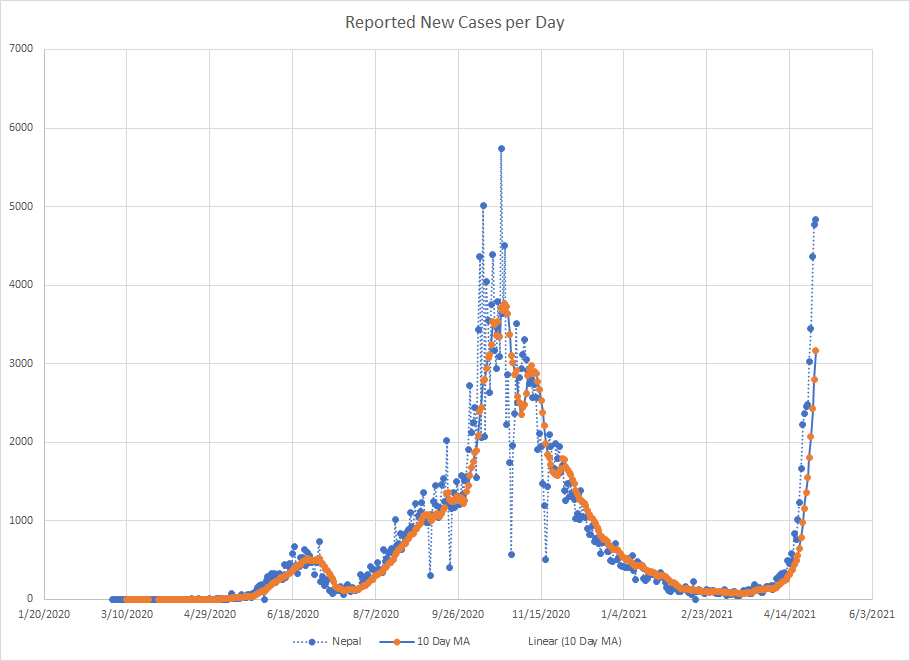
Then we have Nepal where the headlines I saw suggested they are dealing with variants from India. I have no idea if that is the real story or not but that’s what I saw. The wave here didn’t start until mid April so it is still early. If they mirror India, then there is a ways to go yet.
There is also Sri Lanka which looks similar to Nepal as the wave didn’t really start until mid April. I don’t know if this is also going to be blamed on variants from India or not. They’ve already gone beyond the previous peak and the last two days have been among the highest in terms of new cases. Another place that looks like things are just getting started.

The last place in this region is Thailand. I mentioned them earlier in the year when cases shot up after being dormant for eight months. The wave in late January died down but then a stronger one kicked off in early April. There are some gaps in reporting creating some unevenness in the graph. The number of new cases did drop today but it is hard to make too much of one point.

I’ve got data from twelve countries in the Western Pacific region and the average increased in nine of them. There were six places where the average doubled over the month of April. I don’t know if I should really count Australia since the raw numbers went from 11 to 24 so they are low even though they did double. Mongolia makes the list but it looks like things have peaked there.
The biggest rise was in Cambodia. This is another place like Thailand where there were hardly any cases until February of this year and then things really started to spike in early April. Don’t know if it is just a coincidence that they share a border with Thailand and have similar profiles.

Malaysia and Japan would also make the list of places where the average doubled and the highest number was at the end of the month. I’ll just show Japan for illustration. Things have been climbing here since early March but they haven’t gone beyond the peak in early January. Hard to say but it looks like there is some slowing so I’d expect to see a peak soon.

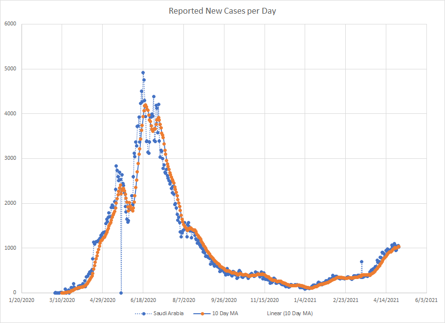
There are 22 places in the Eastern Med region where I have data. The average increased in 13 places and dropped in 9. Previously, we had highlighted places like Lebanon and Jordan but the averages decreased in both places. Four countries (Afghanistan, Iran, Tunisia and Saudi Arabia) saw the average more than double but it looks like both Iran and Tunisia have peaked. So I’ll just show Saudi Arabia to illustrate the worst case in the region.
It doesn’t look anywhere near as bad as some of the other places I’ve shown above and it looks like things are at a peak. They are nowhere near the levels from last year.
In the European region, I’ve got data from 51 places. The average increased in 17 of them and decreased in 34 as much of Europe hit a peak either in April or before. Places where the average at least doubled were Kyrgyzstan, Georgia, Kazakhstan, Uzbekistan and Cyprus. An interesting mix. Turkey was mentioned before but cases have been dropping there for about a week. I’ll skip the graphs because no place really stands out.
In the Americas, I’ve got data from 34 places. Of those, 24 saw an increase in the average number of cases over the month and 10 saw a decrease. The biggest increases were in Suriname, Costa Rica, Bahamas, Trinidad & Tobago, French Guiana, Haiti, Puerto Rico, Argentina, Colombia, Guatemala and Guadeloupe. Outside of Argentina, they are all from tropical parts of the region.
I’ll use Costa Rica as the illustration. The reporting from there contains lots of gaps but things started to spike there in early April. The current average is the highest it has even been

In the African region, I’ve got data on 39 places. Of those, 14 saw an increase and 25 saw a decrease in the average number of cases. Africa is always hard to deal with because many places only report once a week or so and that creates big spikes in the data. There were some places that saw big jumps in the average but the actual number of cases is so low, that it isn’t really worth showing any graphs. The places with the biggest increases were Congo, Central African Republic, Angola, Equatorial Guinea, Uganda and Madagascar. Most of them look to have already peaked.
I’ll just end with two bonus graphs. The Southern Hemisphere is moving through fall and into winter. We know what last fall and winter looked like here and in Europe. Maybe the best places to look at are Argentina and Chile. Chile is much farther along in their vaccination by the way.


Chile is a little harder to read because of one large spike back in June but they did see an increase starting in February but it looks to have already fizzled out even before they get into winter. Argentina has a bigger wave starting a little later but the rate of growth has already slowed. We’d need to see more data to know that this is a peak.
For what its worth, the US and Chile both have just over 40% of the people vaccinated. But it will be interesting to see if the trends in these two places hold up and whether they see a sustained wave during their winter.
