

Well things certainly got interesting on the ‘rona front this week. I’m not going to get into politics because that’s not my thing. But it is a reminder that this thing is still out there. None of what I say here is an attempt to downplay that. I’m really only interested in trying to understand the trends and what they are saying (if anything) about the future.
So we’ll start with the weekly overview. I’ve discovered that the source I use doesn’t always have final data so sometimes things change but I’m always updating and using the most recent data. While the numbers change slightly, the trends haven’t.
For the week that ended today, we set a record with 6.4 million tests. There were 299,780 newly reported positive results which is down slightly from last week. The percentage of positive results was 4.7% which is also down a bit from last week and actually the lowest percentage since the week of June 7th. There were 4,790 newly reported deaths last week which is also down from last week and the lowest total since the week of July 5th.
When you test more and find less, that’s a good thing. I do have a concern that we might have some kind of floor at 5%. We can probably get below that but I’m not sure by how much given the number of tests and the potential for false positives. The lowest total since the start of the year was 4.4% so I’m just not sure how far that figure can actually drop.
On a state by state level, we again had more states move in the wrong direction. This is also where the weakness in my calculations comes in because I don’t take into account the number of tests. So the raw number of positive results goes up even when the percentage of positive tests comes down. I’m just looking at raw positive results and so it can look like states are seeing an increase. Most, but not all, of the states showing an increase are the smaller states where this increase is going to be more obvious. In other words, I’m not entirely convinced about some of them.
So let’s roll through the first group starting with New York with 5 points followed by Connecticut, Arizona and DC with 6 points. Next we get New Jersey with 7 and Vermont and Rhode Island with 8. And we close the group with Massachusetts, Louisiana, California and Florida with 9 points.
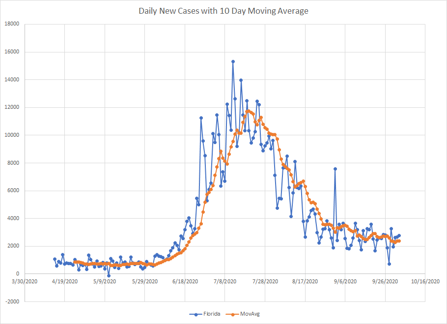
Most of these have been discussed a lot in previous posts. Here is a graph for Florida which I think just missed out on the first group last week. Like California, the raw number of new cases is still large but relative to the peak and relative to the population, it is small. Also, you can see that the moving average line is essentially flat so the growth in new cases is small.
For fun, here is the graph for Vermont. Note the y-axis scale when compared to Florida. Kind of makes you wonder why they are testing. Because Vermont never really had a big peak, it is going to be hard for them to show the same type of percentage decrease that states like New York and Massachusetts can.

We start the next group with Georgia at 10 points followed by Maine with 11. Then we get New Hampshire, Maryland, Pennsylvania and Hawaii with 12. And we close the group with Washington, South Carolina and Texas with 13. I mentioned Texas had a day with a large dump of cases which is now out of the average so they show a big improvement.
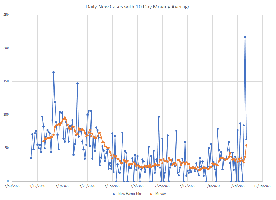
On the other side, New Hampshire had a one day spike of cases that I didn’t find an explanation for. The graph is shown below. It drew the average up and makes it seem like cases are starting to climb. New Hampshire won’t get back to normal until that day drops out of the averages.
In our first two groups, we cover New England and a lot of the places that were hardest hit in the summer. Hawaii was last on the list when I started but that peak is clearly over.
Moving on to the middle of the pack, we start with Nevada, Delaware, New Mexico, Mississippi and Virginia with 14 points. Then we get Oregon with 15, Ohio and Tennessee with 16 and the group closes with Michigan, Alabama and Colorado with 17. Nevada, Delaware and New Mexico showed an increase in cases but they aren’t really accelerating. I suspect this is mostly an artifact of increased testing. Michigan and Colorado have seen enough new cases that they’ve hit a new peak – again I think this likely driven by testing.
Here’s the graph for Michigan. Note a gradual increase over the last couple of weeks. If you were still finding cases at the same rate and you increased testing, this is what you’d expect to see. (To be fair the one abnormally high point does distort the graph making it appear flatter than it probably is). I may have to dig out testing data just to be sure, but this doesn’t really ring any alarm bells for me.

Here’s a graph for Colorado. Slightly different story because you see more of a wave. The fact that the moving average has started to flatten and the fact that the weekly rate of increase is still middle of the road suggests that this new wave has already peaked.

We start the next group with Illinois with 18 points followed by West Virginia and Kansas with 19 points. Then we get Indiana and North Carolina with 20 followed by Minnesota with 21 points. The group closes with Alaska, Kentucky and Missouri with 22. North Carolina and Indiana (and Alabama from the previous group) seem to keep bouncing around. The trend suggests improvement and then it turns around and they are currently at a peak along with West Virginia, Minnesota, Alaska, Kentucky and Missouri.
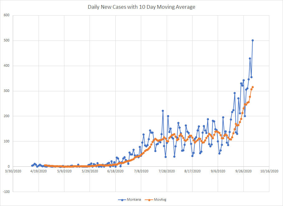
And then we start the last group with Idaho, Nebraska, Iowa, Arkansas and Oklahoma with 24 points. Utah is next with 25 followed by Wyoming with 26 points and then the Dakotas (North and South) with 27 points. The group closes with Wisconsin with 28 points and Montana brings up the rear with 30 points. So Montana is now in last place at the max score.
Here’s the picture to show you what that looks like. The number of new cases grew by 20% week over week which is the highest in the nation (Wyoming was next with 16%). This is the same exponential growth patter we saw in Hawaii and North Dakota earlier. If past trends are predictive, this will continue for a bit. Montana really wasn’t impacted until sometime in June so they may be the last to the party.
For comparison, here is what North Dakota looks like now. The moving average hasn’t flattened but the number of new daily reported cases isn’t reaching new highs so seems to have moved into the plateau phase.

So that’s where things stand. One point is that we are moving into fall/winter and many of the states in the bottom group are places where it gets cold early. Not sure if that will have an impact or not. But if we are truly down to one state showing rapid acceleration, then that seems like we are moving in the right direction.
