

I dipped back into a few news sources today and then quickly decided to scrap that idea. Still too much doom, gloom, anger and a whole bunch of negativity around. It isn’t so much the numbers as it is the commentary on the numbers. Although, to be fair, the numbers can be pretty depressing and relentless as well.
Since I’ve been tracking WHO numbers since March, I just slapped together a graph showing new cases and new deaths by day. This is for the entire world and yes that creates certain problems. The US dominates the numbers of cases so the uptrend at the end is about 30% due to the US. But there are certainly other places showing sharp rises in the number of cases.
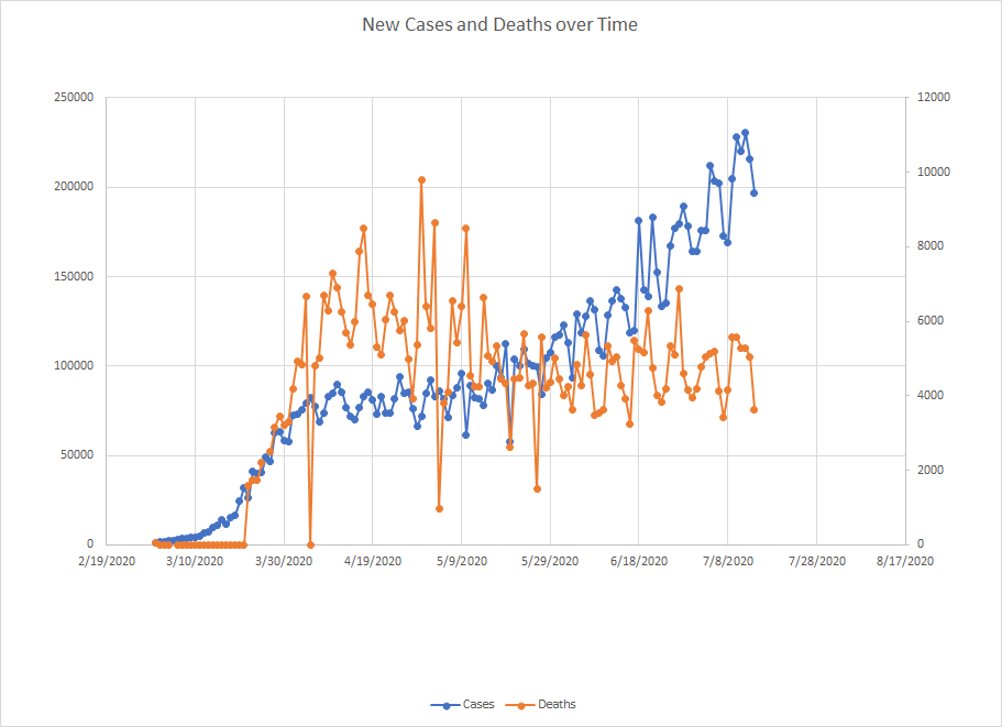
I’ve mentioned before that the pooled case fatality rate has been dropping since things were really ugly back in April. Yes, there are issues with this particular number. You don’t know how different countries count cases and/or deaths. We don’t have good data on demographics like age to tease out that impact. Countries aren’t consistent with their reporting. And what is being reported are what is new on that day – when the case was actually diagnosed or when the death occurred can be much earlier.
Maybe this is just a sign that health authorities are better able to respond now. Or maybe that places are doing a better job protecting vulnerable populations. There’s still room to run in a lot of places and some countries are seeing second waves so it is likely this increase continues for a bit. At some point, it would seem like we hit a saturation point and the number of cases starts to level off. At least that is the hope. We shall see.

